PhotoShop Classroom Exercise
Using Layers to Enhance Photos, Part 2
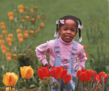
In this project, you will take the picture of the girl in the garden,
and give her a playmate. We'll use Layers, the Stamp tool and a Layer Mask.
If you like, you can use the keyboard shortcuts that I give throughout
the project. If you prefer the toolbox, you are responsible for knowing
where each tool is located.
Open two images
You know, it almost doesn't matter which two images you open. I recommend
this exercise at home: Open any two or three images, at random, and find
interesting ways to combine them. In the classroom, we used the finished
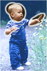
image of the girl in the garden, and cloned a little boy into the garden
to play with her. (Actually, I think he's about to pull her hair.) The
little boy is on your textbook's CD, PhotoShop Bible 5 CD, Stock Photos
> Photo Disk > Signature Series
> Children, Ss03090.


Color and brightness adjustments
The first step is to look at your images and decide whether they have any
problems. Looking at the image of the little boy, it strikes me that his
coloring is cooler than the light in the little girl's image. He is also
much too dark. So we need to adjust both the light and the color.
-
Crop the white space off the bottom of the image. It doesn't matter to
our project whether it is there or not, but the large amount of white will
affect the Levels reading.
-
Open the Levels dialog box (Ctrl-L, or Image > Adjust > Levels.)
-
Look at the histogram. You can see the pixels in this image are grouped
at the dark end of the scale. There should be some black in the
histogram, because the area behind the boy's head is black, but there should
be a nice sampling of colors across the rest of the scale, too.
-
Move the slider at the white end until the image looks lighter, but don't
bleach the color out of the baby's head. You should still see flesh tones,
even on the highlight of his forehead.
-
Move the center slider back to the right a little. You will have to decide
where the settings look best to you. Do Not over adjust.
-
(I started with 0, 1.27, 234, but adjusted the values several times.)
-
Above the slider you will see a small window, labeled Channel. The channel
we are looking at is the RGB channel - a combination of the Red, Blue and
Green information. In the Levels dialog box we can adjust the amount of
data in each of the channels.
-
You now have to remember that Red is opposite Cyan, Blue is opposite Yellow,
and Green is opposite Magenta. When you add one of these colors, you are
subtracting its opposite. When you subtract one of them, you are adding
its opposite.
-
For example, if you take green out of the picture, it will become more
magenta. If you add yellow, you will be removing blue. Look at the image
of the little boy and decide what colors you think it needs more or less
of.
-
Select each of the channels in turn, and add or subtract color as you think
best. When the little boy looks like he might inhabit the same garden as
the little girl, you are ready. This is subjective - there aren't any absolutely
right or wrong settings, as long as the effect is pleasing. You will probably
want to go from one channel to another, several times, until you have the
adjustment the way you want it. Remember, you can select portions of the
image and adjust them individually. For example, if the denim pants are
too dark, but the baby's head is too light, select and adjust separately.
Remember, the background is not going to be painted into the girl's garden,
so it doesn't matter whether you select parts of it.

Outline for selection.
You can create a selection like this, adjust the child's skin tones,
then inverse the selection and adjust the denims.
Cloning the boy into the garden
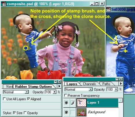
You will now paint the little boy into the garden, using the clone (Stamp)
tool.
-
Create a new layer.
-
Choose the Stamp tool (S).
-
BE SURE ALIGN IS TURN ON, and opacity is 100% on the options palette.
-
Alt-click on the boy's nose.
-
Paint him into the garden, being certain that you are putting him on his
own layer.

Using a Layer Mask
When you have the little boy stamped (cloned) onto his own layer, you will
need to get rid of the background from his original image, that still surrounds
him. We will use a layer mask. A layer mask is like a quick mask, except
that the parts that are masked will disapper immediately. You can paint
them back into visibility, or paint them invisible again.
-
Click the layer mask icon at the bottom of the Layers palette. It looks
like a circle, and is the icon farthest to the left.
-
Look at the Layers palette, and notice that the thumbnail of the boy's
layer now has a second thumbnail image. This represents the mask.
Where it is painted white, you can see the paint. Where it is painted black,
the painted pixels are invisible.
-
Be sure you have the Paintbrush (B), Default colors (D), at 100% opacity
(press zero to get 100%). Start painting over the background that surrounds
the boy. If it isn't disappearing, switch your foreground and background
colors (press X).
-
When you want to paint something in, paint with white. When you want to
paint something out, paint with black.
-
Note that when you are painting on the mask, the mask icon will appear
beside the thumbnail. If you are painting on the image, a paintbrush appears
there.
-
When the boy looks realistically as though he is in the garden with the
girl, Flatten the image (Layers > Flatten Image).
-
To frame the image, Select All (Ctrl-A), then click Edit > Stroke > 15
pixels.
-
You can Save A Copy in the jpg format.

Christine C. Frey
cfrey@erols.com
