
|
|
|
|
|
|
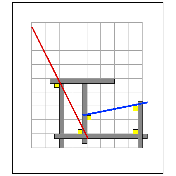
| The most innovative aspect of the Rietveld red blue chair is perhaps its design on a modular grid. Here I shall analyze the problems he had to solve within these self imposed restriction. Chairs effectively serve to assist man to stay in a possibly comfortable way in a sitting position and as such they have more in common with anthropometry than with mathematics. Rietveld has his motives to solve this equation. |
 |
Rietveld's module is 10 cm. | |
| THE MODULAR GRID
After some experimenting Rietveld opted for a 3 dimensional 10 cm grid
with a finer gradation of 2,5 cm. The grid is used as a guide in the assigning
the position of the single components of his chair in such a way that these
elements are just leaning on the grid. (note 1)
My first teacher has been Gerrit Tomas Rietveld (1888-1964) in 1953 in a special course on Industrial Design at the Royal Academy in The Hague, Holland. His lessons were of utmost importance for us young and curious students. One thing I remember very well was his revelation that some aspects of esthetics are rational inasmuch we can apply mathematics. The teachings of Rietveld were sober and pragmatic with a special accent
on modularity as an optimization of the industrial process and at the benefit
of the user, both esthetically and functionally. (note 2)
He also explained his concept of another famous chair, the zig-zag: the idea being to contrast the cage like space enclosed by the traditional four legs using instead a membrane that divides the front side space from the backside space: a chair as a space divider or a screen. At first he tried to use fiberglass reinforced polyester with a steel frame but the final solution was done in dovetailed wooden planks. Rietveld was a positive and relaxed person, he even gave the impression of a modest artisan, never indulging in intellectualistic declarations like his friends in the De Stijl group, Theo Van Doesburg or Piet Mondriaan, preferring to talk about materials and construction, on how to do things in a simple way. * What counts in product design is maximum simplicity and clarity of expression, easy to produce and resistant for daily use *, he used to tell us. We should imagine him in 1917 when designing the * red blue *: his challenge was to construct an easy chair in a modular grid with simple elements of the carpenters workshop or the furniture factory, wooden sticks and flat plywood sheets, and just with doweled connections. But things are never so simple as they seem as we see in these pages
on the red blue chair.
THE APPLICATION OF MATHEMATICS IN ERGONOMY One primary functional problem that Rietveld had to solve was how to adapt the ergonomic requests of a medium sized adult in comfortable seating position to such a rigid geometric scheme. This is in reality more modern version of the ancient endeavor to reveal geometric relations or proportional symmetries in the, idealized, human body. It was studied by the ancient egyptians, by the greeks and the romans like Vitruvius, in the renaissance amongst others by Albrecht Dürer, and Gianbattista Alberti , and in our time by Le Corbusier who, in his * Modulor *, developed a logarithmic scale of dimensions, applicable in building and in industrial design, based on the sizes and proportions of the human body. (note 3) The question of the geometrical relations in the human body is scarcely considered in anthropometry and it is still open in ergonomy. Have a look at some suggestions. |
||||
| A PIVOTAL SIGN IN PEIRCE'S SEMIOTIC
The diagram (number 5 in the design tree) or schematic description of the topological relations between the parts of Rietveld's red blue chair exemplifies also an important sign category Peirce's semiotics, the iconic legisigns. (as well as in the Cabbala as we will see later and as mentioned earlier) This sign is, as Merrell explains, * the first sign of the nature of a general, a universal, or type. Each instantation of this sign embodies a definite quality, or iconicity, which serves to call up in the mind a general idea - though at this point it remains quite vague - of the object. * (note 4) In Rietveld's chair it exemplifies how a chair, or indeed any other piece of furniture, can be made to satisfy functional, ergonomic, productive and esthetic requirements within the rigid limits of a simple modular system of structural elements and standardized joints. Here, it seems, human inventiveness reveals its real force as a rupture between abstract speculation and pragmatic convention. The diagram shows in extreme synthesis how a radical innovation can overthrow conventions, open new roads. In the case of Rietveld's chair we can see the practical result as an image in sign 4, the product itself, whereas the implications on a speculative level can be seen, symbolically, in signs 8, 9 and 10, but the essence of this design, what we could call the idea, is represented in sign 5, the diagram. |
||||
| On the next page I analyze the similar role of this sign, as Tipharet, in cabbalist mystical speculation. | ||||
| The next sign in our analysis of design language is about the importance of the design of the details of the product. |
| note 1 | a site about Rietveld:
http://www.danbbs.dk/~nyboe/ |
| note 2 | site about modularity:
http://www.cssh.qc.ca/projets/carnetsma/mathematiques_renaissance/nombre_or.html |
| note 3 | Le Corbusier, Le Modulor, 1949, german ed. 1953, Gotta, Stuttgart, p.67 |
| note 4 | Floyd Merrell, Semiosis in the Postmodern age, Purdue University Press, 1995, p.140 |
|
|
|
|
|
|