
|
|
|
|
|
|
 |
||||||||
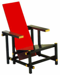
| The mythical red blue chair was designed in 1917 and is still in production
by Cassina.
This chair, as a whole, is a sign among other signs. It stands here
of course for the * product *, and figures as the fourth sign in peircean
semiology, a Dicent Sinsign or the sign that * provides a direct experience
of, and information concerning, the semiotic object *. (note 1)
Before we consider the cabbalistic implications I will consider now
some of the visual impacts of the Rietveld chair.
|
||||||||
THE SIGNIFICANCE OF COLORSAll the colors of this chair obey the dogma of DE STIJL, as dictated by its founder, Theo van Doesburg and members like Piet Mondriaan, Bart van der Leck and others, that is the exclusive colors to be used should be red, blue, yellow or black, gray and white. Mondriaan writes in 1917, (in the same year the redouble chair was designed):In abstract real painting primary colors imply color in its most basic aspect. Primary color thus appears very relative - the principal thing is for color to be free of individuality and individual sensations, and to give expression only to the serene emotion of the universal.. (note 2) The frame is black, serving his supporting function as unobtrusive as possible, just as it is suiting for servants to the main actors, the seat and backrest, as we can see in the japanese puppet theater Bunraku manipulated by men in black clothes that the public fakes not to see on the background of a black curtain.
The armrests belong to the same category as the parts that compose the frame: horizontal, black with yellow cutting edges. For Rietveld they contribute, as signs, evidently more to the communication of stability of the structure than to the comfort of the chair. The seat is blue, a color associated with horizontally, passivity and the feminine. The backrest is red, a color indicating verticality, aggressiveness and the masculine. As often in semantics, our search for meaning in Rietveld's formal expressions
reveals an apparent traditional social pattern suggesting that the fundaments
of human culture are reducible to a few schematic polar categories. This,
by the way, is also my fundamental critic to current marketing: to reduce
variety of phenomena's of reality, albeit in the interest of product planning,
to a few traditional categories like male female, young - not so young,
poor - rich, etc., is not likely to produce consistent affection for the
planned products in potential users because reality is far more complex.
This virtual invisibility of the black supporting frame has the effect, certainly envisaged by Rietveld, of an apparent weightless suspension of the colored seat and backrest. He thus achieved an impression of the main ergonomic elements floating in space. This endeavor for lightness is perhaps best expressed in his buffet. Here the single elements are separated by struts conferring transparency to an normally massive product like a sideboard.
|
||||||||
| AS A DECENT SINSIGN, THE CHAIR IS THE SEMIOTIC OBJECT
Peirce names this category of signs Decent Sinsigns: * It is the initial sign that provides for direct experience of, and information concerning, the semiotic object ... In a comparable dyadic sense, a portrait (icon) wt. the artist's signature (index) informs the onlooker of the sign regarding its subject as well as its author * (note 3) We should read here instead of the portrait * the red blue chair" and the signature should become "the typical Rietveld Style". |
||||||||
| NEZACH OR THE SIGN OF CREATIVE IMAGINATION
In the Cabbala this is the sign of Prophecy or Nezach (or Netzach). * The Seventh Path is called the Occult Intelligence because it is the refulgent splendor of the intellectual virtues which are perceived by the eyes of the intellect and the contemplation of faith. * (note 4) Actually we see here the object of our analysis and we are invited to reflect about Rietveld's intentions. The author warns for misconceptions and superstitions related to this sign. Furthermore he explains that the intellect that is mentioned should not be restricted to logical processes of the concrete mind but to the human mind as a whole, the psyche. It is in other word the sign of creative imagination. |
||||||||
|
The next sign introduces us to the essence of the conception of the object, in our case of the design object. Rietveld effectively has always pointed out how componebility and modularity are the essence of languages, verbal as well as visual. |
| note 1 | Floyd Merrell; Semiosis in the Postmodern Age, Purdue University Press, 1995, p.140 |
| note 2 | cited in Hans L.C. Jaffé, De Stijl, Thames and Hudson, London 1970, p.55 |
| note 3 | Floyd Merrell, op.cit., p.140 |
| note 4 | Gareth Knight, A practical Guide to Quabalistic Symbolism, Samuel Weiser, York Beach, Maine, USA, 1993 (1965), p.150 ff. |
|
|
|
|
|
|