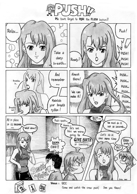
An old comic I drew for my former hostel's Hall Bulettin Board.
The graphic artists (which is how we refer to the illustrators)
were asked to come up with an A4-sized comic strip each. The strips
were supposed to be "toilet humor". Please don't interpret this
phrase wrong. It means simply comic strips to be put up on toilet
doors to be enjoyed by the hostellites while they are doing their
business.
Side rant: This shows how Singaporeans refer to things a bit
differently; which leads to likely misinterpretations.
This happened around January, just one month before the annual
Hall Production, considered as a major event in hall life.
This gave me an idea to somehow relate this event to the comic.
Attracting a smile while promoting an event, why not?
The problem is... I had no idea what the event was about.
...
Arr... Let me rephrase the last sentence. I did know what the event
was about. It is a life play, usually musical, with Kent Ridgeans
filling the whole cast. However, I didn't know what the play was.
All I knew were: (1) it was going to be musical, (2) the title was
Beauty World, (3) it was based on a script written by a local
writer.
Well, I somehow thought up this "push" joke. It is quite cheesy, lame,
predictable, cliche, etc, etc. However, I really didn't know what else
to draw and time was running out.
Initially, I wanted to draw a guy. I don't know why, I just kept drawing
males in my life. This time, I had finished watching the anime Noir
during the June-July holiday. Browsing through my image collection, I suddenly
felt the want to draw one of the characters.
By the way, Noir's main cast is an all-female one. The two main characters are
Mireille Bouquet and Kirika Kimura. While watching the series,
I prefer Kirika as she is full of surprises. However, Mireille looks better on
pictures. So, I chose Mireille. I really enjoyed drawing her hair, although I
did meet difficulties because I had limited references.
The other factor affecting this comic was Watsuki Nobuhiro's manga. He keeps
using SD scenes to relieve dramatic/emotional scenes. That gave the idea to
finish the comic whith SD scenes.
I posted this in
Protocol Seven's
online forum once and the people there said that the SD scences made it look
as if the last two panels were rushed.
Perhaps this is true, because I did finish the comic just before the deadline
(but, strangely, I apparently was the first illustrator to submit a comic), but
I cannot recall rushing so badly that I need to compromise quality. This is an
indication that I still judge my works too subjectively.

|
On hindsight, I don't think I did Mireille justice. I drew her eyes too
close to each other.
And look at the third panel. I drew her eyes too big
when she is "breathing in".
The shadings were done using blunt HB and 2B pencils.
I tried to experiment with pen "shading" for the background of the fifth
panel. Not too successful because I'm not patient enough to ensure equal
space between two lines.
Dimension: A4 paper (21 x 29.7 cm)
Paper: printing paper
Pen: Pilot drawing pen no. 03 and no. 08
Pencils: 2B mechanical, 2B genuine, and HB genuine
Software: Photoshop 6.0
Work duration: around 3 days of pencil drawing, half a day of pen drawing,
30 minutes of shading, and another 20 minutes of Photoshop
cleaning
Date finished: mid January 2002
|
Any comments, suggestions or critics?
Contact me: at comp dot nus dot edu dot sg with dennyisk before the at
Last edited: Friday, 1 November 2002
|
The material published on this Web page is personal, and is not endorsed by or the
responsibility of the National University of Singapore.
|
