It seems that I draw fanarts for Wish^3 only when there is a contest... ^^; I was planning
to break this when yet another contest (even though this time it is "semi-unofficial").
I have never drawn Paige (the female main character), so I wanted to use this
chance to draw her. (Well... actually I drew her once before this, but I didn't finish that
drawing.)
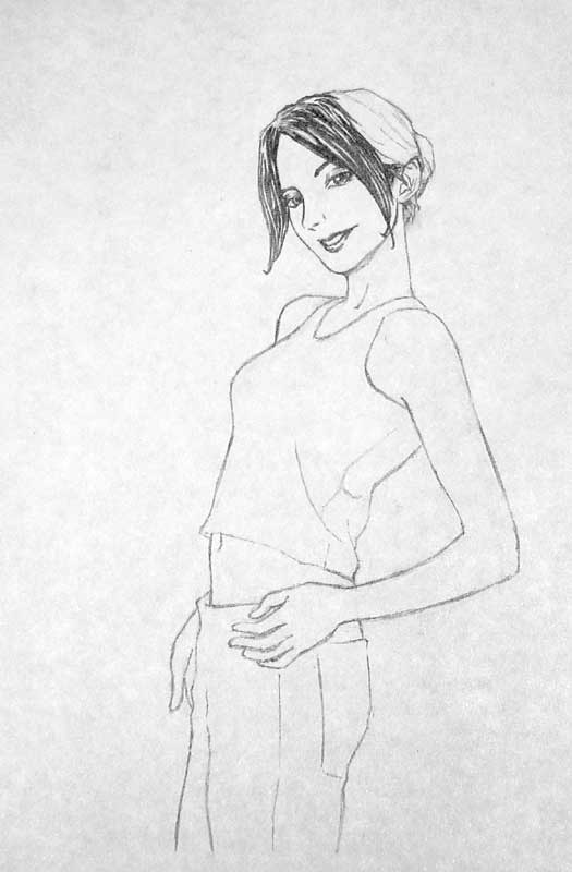
There is really no story behind this drawing. I just looked for a good reference pose from
a magazine and replace the head with Paige's (I'm lame... if you are reading this, Syl,
please forgive me). The pencilling was surprisingly quick, only around one hour. My
copying skill must have improved from the so many copyings I did :D
I got a number of excellent feedbacks from Anindo forum. The first one is that her legs
look unnatural. I think that is because I drew her left leg improperly with respect to her
belly. Another one is that her bottom is not full enough for female proportion. As trivial
as these seem, I failed to notice them until I got the feedbacks, so that makes them good
feedbacks. Thanks to I-chan and Mizu for the feedbacks :)
Another feedback, which I have already noticed, is that the highlights on her black hair
are all over the place. Urr... well... That's what I got for being a Takeshi Obata (the
mangaka of Hikaru no Go and Death Note) wannabe ^^;
Now for random thoughts I have about this drawing... At times, I can't help seeing
a female Edward Elric (or a feminine bishounen-style of him) when I look at this drawing
^^; Must be the similar split-in-the-middle long bang and tied blonde hair...
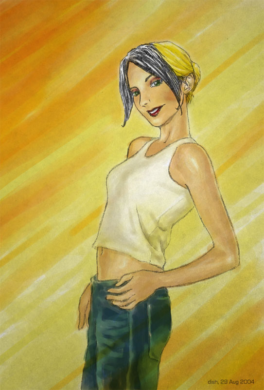
Another thought is how colouring affect the perceptual quality of the image. In my opinion,
Paige looks thinner in the coloured image. The colouring of her arm defines its muscles,
thus making it look thin. The cosmetics on her cheek makes her head look narrower, and
the eye shadow make her eyes look more feminine. Am I imagining these things?
Anyway, I was quite happy with the colouring. The streak effect of the background was
accidental, I cannot claim a credit for "creativity" in this respect. I tried my best to
keep the colours as close as possible to the reference; but the background colours are
my idea because the reference has a white background. Still, the skin and shirt shading
is completely to the credit of the reference. This also explains why I suddenly apply
cosmetics to my drawing. Usually I only go as far as lipstick and mascara, but this time
I actually went further to eye shadow and "cheek colouring" (I really don't know the proper
name). I guess cosmetics colouring is the new thing I partially learnt from colouring this
:D

|
Line drawing (left)
Dimension: A4 paper (21 x 29.7 cm)
Paper: printing paper
Pencils: 2B mechanical
Work duration: one hour pencilling
Date finished: 29 August 2004
Coloured image (right)
Software: Open Canvas 3 for colouring; Photoshop for gradient filter
Work duration: around 4 hours colouring; few minutes of filter trials
|

|
Any comments, suggestions or critics?
Contact me: at comp dot nus dot edu dot sg with dennyisk before the at
Last edited: Monday, 13 September 2004
|
The material published on this Web page is personal, and is not endorsed by or the
responsibility of the National University of Singapore.
|

