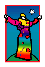
One of the most useful tools in PhotoImpact, particularly to a beginner, is the Frame Designer which is accessed through the Web menu. It allows you to create professional looking frames with only a few mouse clicks. To illustrate the frame maker I have chosen this Peter Max image because it requires a few things in the way of adjustment. You can see that there is some white around the red edging and that the white is not even all around.

I can't crop this up to the red lines because the hands are in the way. I like the effect here of a white mat around the picture with a frame outside of that. I will go to Edit, Expand, click on the padlock to unlock it and try adding pixels as follows: L, 12, R, 10, Top, 15, Bottom 14. When I do this the right side is still a little larger, so I am going to Undo and add 1 more pixel to the other three sides. That still looks a little uneven to me so I went back and added 1 more pixel to the three sides. I could have taken one off the right as well, but I want more white space. Here it is with L, 14, R, 10, Top 16 and Bottom 16.
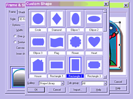
Open the Frame designer, there will be no Style selected. I am going to put a 3D frame on this so I select 3D. I just want a plain rectangular frame so I scroll down through the preset examples but don't find one. I just want a narrow frame and the first one, turquoise with an arched top is close to what I want so I select that. Now click on Inner shape and select Rectangle 2. Then I must go back and click on Outer shape and select the same Rectangle.
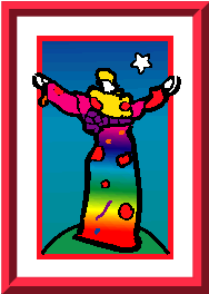
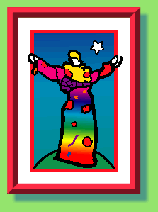
Now the white mat is not showing so I am going to select Outward, the frame is also a little wide so I change the Width to 15. The default color isn't bad looking but I think I want a red frame. I check the one color box and use the eyedropper (selected on the right click menu) to pick up the red from the border around the picture. Now I can save this with or without a canvas. Click on the shadow tab and uncheck both shadow and canvas. Below is the result.
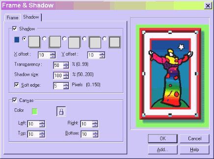
If I decide I don't quite like what I see, I can hit undo and go back into the Frame Designer. It has remembered the setting that I just applied so I can just make the whatever adjustments I want instead of having to start over. I have selected a green background and navy drop shadow to the right and bottom here, the shadow is 50% transparency, you usually want some transparency to a shadow, it looks more natural.
Now I can put this into stationery by tiling it down the left and coding the background to match the green of the canvas. Or I can expand the canvas if I wish.
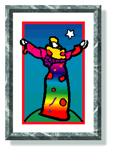
You can also choose one of the textures available in the texture library. Here is the same frame in marble with a green drop shadow to match and on a white background.
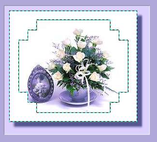
You can also use the 2D frames to create a shape for your frame and then apply color and texture with a filter. Here I have selected a rectangle with fancy corners. I wanted a contrasting color to select easily, the exact color at this point doesn't really matter.

Then I select the frame with the Magic Wand and flood fill it with white.
I then apply a Blade Pro filter effect (more about this and other filters later.)

More on Frames on the next page.


