| ALIGN=TOP | ALIGN=MIDDLE | ALIGN=BOTTOM | ALIGN=BOTTOM BORDER=1 |
| |
|
| How To Put Graphics into a Page |
As an example, a 3" by 4" color photograph is about 91,000 bytes, uncompressed. Stored in gif format, it takes about 52,000 bytes. In jpg format it only takes 42,000 bytes.
Tables can be used, as I have here, to provide better control of the layout of images and text.
<IMG SRC="camera.gif" WIDTH=32 HEIGHT=32 BORDER=0 ALIGN="TOP" >Camera
| ALIGN=TOP | ALIGN=MIDDLE | ALIGN=BOTTOM | ALIGN=BOTTOM BORDER=1 |
| |
|
You should always specify the WIDTH and HEIGHT for an image. This is because the images are not loaded at the same time as the text of the page. After the browser gets the text, if the HEIGHT and WIDTH parameters are specified for all graphics, the browser can start building and displaying the page. If these values are not provided, the browser has to wait until all graphics are down loaded and it can determine the size of each of the images before it can build and display the page.
If this takes any time, due either the number of graphics or the size of the graphics files, or the loading of the server that is providing the images, the user may get impatient and hit the STOP button before seeing your page. If the text comes up, they may wait it out.
Also, you should always specify an ALT="text" parameter. In case the user hits the STOP button, all the places where graphics would have been have a short title stating what the graphic should have been for that location on the page. Seeing this, they may choose to hit the RELOAD button to get your full page.
| This is what you see if the image doesn't load and there is no ALT value. | This is what you see if the image doesn't load and there is an ALT="MISSING" value (the ALT message may not be shown for all browsers, though). |
When specifying the WIDTH and HEIGHT for an image, you can take advantage of the browser's ability to resize graphics, as shown here. Be careful, though, to maintain the same ratios for the WIDTH and HEIGHT when changing the values or you can distort the image (the third example).
| Image with HEIGHT=32 and WIDTH=32 |
Image with HEIGHT=64 and WIDTH=64 |
Image with HEIGHT=50 and WIDTH=150 |
||
| |
 |
 |
Putting a page up before a viewer can be hindered if it takes too long to download the images. If you display only the blank place holders, the viewer may get impatient and STOP or BACK out of your page.
A solution to this is the use of the LOWSRC parameter in the IMG SRC= tag.
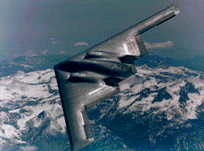
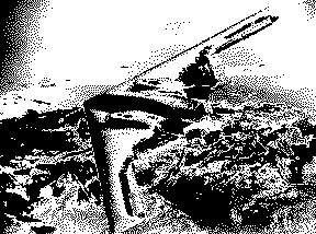
For example, the left image below is a gif image that requires 29 KBytes. The right image, created from the original with PaintShop Pro by reducing the image colors, solarizing, and converting it to black and white, reduced the size to only 7 KBytes, which will load considerably faster.
 Full image (29 KBytes) |  Low source image (7 KBytes) |
<IMG SRC="b2.gif" WIDTH=288 HEIGHT=214 BORDER=0 LOWSRC="b2-16bwsolar.gif">
the smaller sized image will be loaded first. Then, when the rest of the page is loaded, the browser will go back to the server and get the full color image.
In the left set, all images and captions are centered in the cells by using the option ALIGN=CENTER in each of the TD (Table Data, actually the table cell data) tags. In the right set, the images are aligned to the left and right to be closer to the text and the text has ALIGN=RIGHT (for the text at the left) and ALIGN=LEFT (for the text at the right) to bring it closer to the image. The lower right text has VALIGN=BOTTOM set (to align the text in the vertical bottom of the cell as well).
As you can see, you have quite a bit of control of how your graphics and text can be related when you use tables. Other examples using tables are shown on the Tables page.
|
|
Note: This page created another browser window because of the TARGET="_blank" parameter in the <A HREF= ...> tag that got you here. You can simply close this browser to return to the prior page (which is in its own browser window).
Most recent revision Jan. 7, 1998