 I took away a lot of the busy background and kept color in the navigation bar. I took away a lot of the busy background and kept color in the navigation bar. (Click on any image for full size view) |
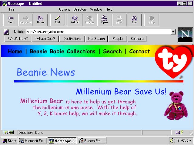
In my Interface & Design Layout for the Web class, our first project was to improve an on-line site which happened to be the official TY Beanie Babie site. My improvements to the site are show in this first screen capture.
 I took away a lot of the busy background and kept color in the navigation bar. I took away a lot of the busy background and kept color in the navigation bar. (Click on any image for full size view) |
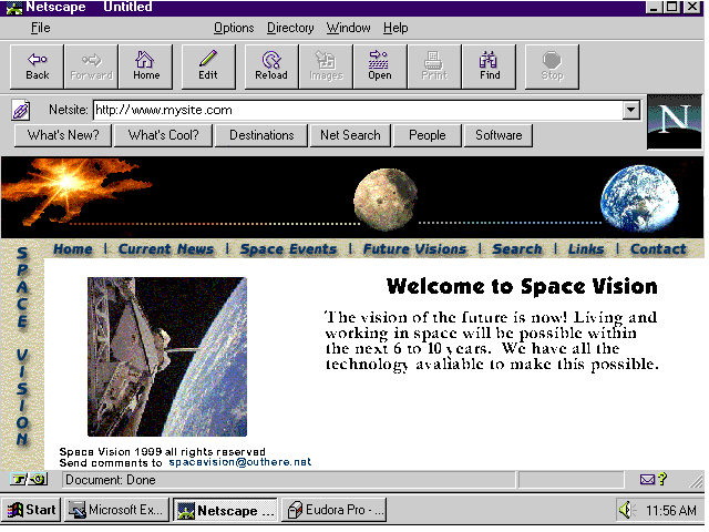
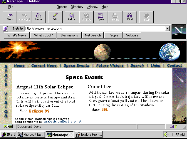
The final project in the same class was to create a front page of an imaginary company and follow with another page to one of the links provided on the fromt page. These are the screen captures of this project.
 This is the front page of the imaginary company Space Vision. |
 This page is the page loaded when clicking on the Space Event section of the navigation bar at the top of the page. |