|
|
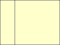
Page Design Hints and Links HTML I am REALLY no expert when it comes to html. A lot of my knowledge has been gained through trial and error, and a lot of jiggling and juggling, but here are a few things I've discovered and links to some people who know a lot more than I do. The proper HTML for a page background is: Tables If you are going to work with border/backgrounds, it's a very good idea to enclose your page content in a table with invisible borders. This keeps your text from running into the border if the size of the window is reduced. (If you have no idea what a table is, please refer to the HTML links below.) I like to use a Web page software program that lets me see what the table actually looks like. If you could see it, it would look something like this:
A table for a border background page should always have an empty column on the left side to keep the text from running into the design.
You can change the dimensions of the glass brick to suit your needs. It also comes in handy when you want extra space within your page. I used it in the background examples to push the "back" buttons down toward the bottom of the page.  If you try to right-click on a background but don't get "Save background as", you might be clicking on a glass brick. Just move your curser a little to the right or left. If you try to right-click on a background but don't get "Save background as", you might be clicking on a glass brick. Just move your curser a little to the right or left.
Some experts recommend designating the total table size in percentages and others use pixel size. My total table sizes are designated in pixels because that's the way my software does it. My columns are a percentage of the total table width. Depending on the content of the main body and the width of the border, my left columns are usually around 25% to 30% of the total table. Based on an 800 x 600 resolution, my total table widths are usually from 550 to 600 pixels. This is where you "jiggle and juggle" to make your page look nice. Depending on your content, you might or might not want to center your table on the page. HINT - Look at your page in as many different ways as you can.
Change the resolution, reduce the window size, check it on a different browser or somebody else's computer.
Text The bottom line here is - Just make sure it's easy to read! If you haven't visited my "Wild Tiles" section yet, go there and click on the example to see text suggestions for a busy background.
Also, 256 colors (8 bit) just won't do it. Some of my designs look horrible with 256 colors. About Background Sets Why didn't make I any? Even though I've used some buttons on this site, I've found that sometimes they're more trouble than they're worth. They use space and increase load time, and so do bars. If you want to use one of my designs on a Web page and want a set, I'll be glad to make it for you. Just E-mail me. (Warning: I don't do fancy text like "Welcome" lettering very well.) You are welcome to download and use the two "back" buttons I've used on these pages -
The first is a transparent GIF for light backgrounds. It will allow the background color to show through. The second is a JPG. That's all for now. I'll add information if I think of something. Links to Page Design and HTML Help Eve's Realm
Copyright © 1998 Nancy Bower. All Rights Reserved |


