|
|

design practice and theory
CLICK THE RED DOTS IN THE LOGO TO OPEN NEW PAGES AT RANDOM |
|
|

design practice and theory
CLICK THE RED DOTS IN THE LOGO TO OPEN NEW PAGES AT RANDOM |
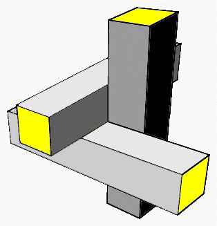
Rietveld writes as follows about his joints:
|
 |
the three dimensional joint of the red-blue chair as well as of many other furniture design of Rietveld indicates unendless Euclidean cartesian space | |
 |
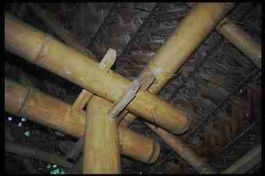
Traditional bamboo trusses show non intersecting beams and girders with protruding ends. | |
| want to know more about bamboo? look at the following links
http://www.bamboo.org/abs/BambooOnTheInternet.html
|
| THE DICENT INDEXICAL LEGISIGN
Merrel explains this category of Peirce's signs as follows: A Dicent Indexical Legisign is characterized by a commonplace expression... Its fully embodied meaning remains vague, since the sign and its 'semiotic subject' are not yet drawn from the limbo of covert relations. (note 2) The meaning of any sign and any set of properties partially specifying it is always open to further specification either on the part of the utterer by way of her engendering successive thought signs or the addressee through his ongoing interpretation of them. (note 3) As an index its fulfills the function of a representamen by virtue of a character which it could not have if its object did not exist, but which it will continue to have just the same whether it be interpreted as a representamen or not *(CP5.37) As a Legisign it contains a general type, 'Legi' implies a repeated use or replication, which becomes, by habit, a general type. (note 4) Effectively we are zooming in on the Rietveld Red and Blue Chair evidencing the detail of the joint, or the general type of connection used not only in this chair but in some other Rietveld furniture as well. The importance of the detail, the fragment, in design products can not be over stressed. It is simultaneously the locus of materialization of concepts or idea's and of manifestation of specialized signification. Nothing extraordinary if we limit our consideration to the expression of function, for example the connection function of joints, but if we pay attention to other types of signification, such as the hidden meaning of form, texture and color, we have a different picture. What is the meaning of convexity versus that of concavity, or of flatness ? Ribs and holes, glossy surfaces, transparency, color: all these are enigma's to solve. Even characters simulating functionality often serve to convey hidden
messages, such as efficiency, modernity or sportyness. The catalogue of
these signs is virtually endless, its use fundamental to the appreciation
of the design product as designers and marketing know. The reason for this
capacity of penetration in the mind of the users is however less known.
My explanation is that they may escape partly from pragmatic explanation,
exposing merely a modest subordinate detail of the whole product, the global
product being instead mostly an explicit expression of its potential
general function, such as: apt to sit upon, to look at a screen, to travel
in, etc. In this subtle way those Dicent Indexical Legisigns inherent to
details continue to feed our subconscious Jungian archetypes
|
| HESED THE SIGN OF MERCY IN THE CABBALA
In the Cabbalah, this sign corresponds to Hesed or Chesed, the
place of Mercy and Receptive Intelligence: it is also the topos of forces
that actually cohere into forms.
Hesed is the supreme height of manifestation of form: it emanates all rulership over the world of forms; it is called the sphere of the masters;The ancient wisdom of Sephirotic rabbi's designed the Sephirot tree of life as a map of consciousness and assigned to Hesed, or Love, the compensatory function to Gevurah or Din, the sephirot of Justice. In our to design adapted version we might consider how the intelligence and love of beauty of the designer counterbalances the pragmatics of industrial production, or the moment of verification, or truth, of Gevurah, with his creative intuition that in practice can be freely exerted mainly in the details. Marketing should recognize this truth and better understand how Hesed is capable to resolve many apparent contradictions. Mies Van Der Rohe once wrote, citing Warburg, that God resides in the details. |
| Next page is about symbols in design |
| about the modular grid |
| the meaning of colors in Rietvelds chair |
| back to the general analysis of Rietveld's chair |
|
|
|
|
|
|