I decided to save ourselves the trouble with all the questions, e-mails, and repeated instructions about how I edit my graphics by putting up this little section. First of all, the graphics-editors I currently use are Adobe Photoshop 4.0, KPT and Eyecandy. However, I do most of my editing using Adobe alone, so naturally I would be babbling about the styles I use in there. You may find it difficult to follow with a different graphics-editor if you're planning to, but you still may pick up some tidbits and can probably improvise with your own graphics-editor. Sit back, read on and enjoy. It's not yet complete, but I'll add up the rest as soon as I finish gathering up all the stuff I do with my gaphics-editor. ^^;
Quality and Colors of the graphics
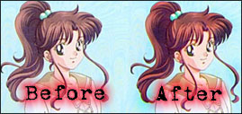
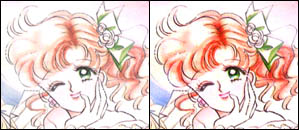
How many times have you shied away good art simply because the color was too dull and fuzzy? I happen to face that problem a lot of times (especially with the graphics from FTP sites or given by friends), and I just can't afford it because it's rare to find a good Mako-chan pic. So I make use of what I have with Adobe 4.0. For enhancing colors of your graphic, you can use burn tool (for lightening), dodge tool (for darkening) and the sponge tool (for brightening/sharpening colors). Try scrubbing the graphics with the sponge tool. This is what makes the colors more flasy, and it is very important. I use the sponge tool all the time with Mako-chan's eyes, so they would show a lovelier and brighter shade of green. But don't use too much of it; if you do, the scuzzy areas of the graphic will show. This is the time to use the burn tool. Darken the spots which are too flashy by clicking over the areas lightly. Darkening the areas can also mask areas which are fuzzy, scuzzy and grainy.| You can lighten areas if necessary by using the dodge tool. This technique is guaranteed to enhance the quality of colors and give it a flourished look. (The dodge tool is located at the 2nd column, 6th row of the tool bar. The sponge tool and the burn tool will appear if you hold your click long enough on the dodge tool icon.) |  |
Colors are very important. They can hide a lot of those scuzzy areas and can make a low-quality graphics look a lot better. The difference can be shocking actually, epsecially if you view that "Before and After" pic at it's original size.
 | Another way of presenting a graphic in deep and richer colors is adjusting it's color balance. To adjust the color balance, click IMAGE on the menu bar then choose "Adjust". Select "Color Balance"; it will show you the color amount and levels. Usually, I choose to adjust the red color level because it matches better with Mako-chan's auburn-looking tresses. |
[ DEG Interactive ] [ Main page ] [ Index page ]


