|
| |

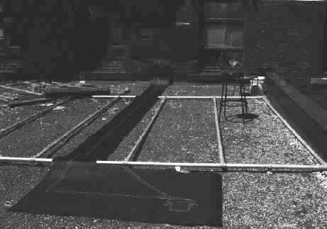
30' x 6': wax pencil, silver pen on tarpaper
�1999 Luke Andritsos
live large

trip fantastic

is this for real?

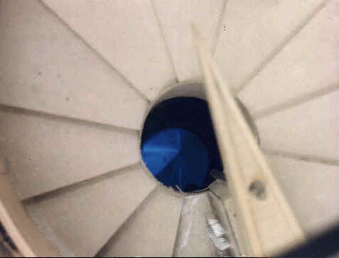
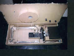
mdf, steel, mirros, glass, electronics �1999 Luke
Andritsos
Dynamic
patterns obviate static ones. The design
strategy will be to follow the CALM field of knowledge (or, what Robert Pirsig calls the
static pattern of the dominant mythos, 144) until it bends, compresses or is otherwise
modified by forces of the unknown/ unforeseen/ unrevealed. This edge condition should
instigate a phase transition (quantum leap, emergence, correction, appropriation). Rene
Thom penned this the Catastrophe Theory (Jencks 53). Then would follow the architectural/
phenomenological pointers of IGNITION,
EXPLOSION, AFTERSHOCK, and CLARITY.
The aim was to distill from this vast field
of information a successful cohesive architectural investigation into the thesis and lay
the groundwork for post-graduate research.
MID TERM
REVIEW
avant
What to present?
"Don’t say
too much...": David Lieberman, thesis advisor. Further: "Drawing and modeling are in themselves architectural
research..."
There was a wealth of strong feedback to mull
over from the panel during the review of December 15th:
 | The proprietorial stuff
should be distinguished from the parts of the project actually designed
|
 | A suggestion was made to perhaps
treat the project as a future archaeological dig; this was then retracted by Van Elslander
who thought it would then be a "myth of failure"
|
 | Perhaps efforts should be focused on
designing only one aspect of the project in detail
|
 | At one point the project was deemed
"slippery" in that programmatic elements escaped the necessity to relate
architecturally due to the vast distance (2 km) separating them.
|
 | The "model" booklet could
have taken the form of an engineering manual, due to the technical nature of the program -
it seems more of an accumulative travel log from a previous era.
|
 | The original media of brown paper
was not slick enough for some tastes
|
 | It was suggested to explore the
hi-tech aspects on computer. In effect, the computer would "eat itself" in a
critical manner
|
 | The tunnel needs to be designed
between the disparate program elements
|
 | It was recommended that I refrain
from naming the specific elements of the project (e.g. Vertigo Theater). However, I find
that the act of naming itself provides buzzwords that drive the architecture.
|
 | The project itself could be
site-less/ moving. This would result in a far more theoretical investigation
|
 | A preoccupation with science fiction
iconography was identified
|
 | The project seemed classical in its
proportions and emphasis on circular forms
|
 | The thesis was reiterated as
"architecture that gathers knowledge." How is this data then disseminated, if
indeed it ever is?
|
FINAL REVIEW
The perplexed expressions on the panel's
faces revealed the project was a spectacular success!
landritsos@hotmail.com
   
|