My
work as webdesigner started when I just had entered Journalism school and
i got the oportunity to work at Project Virtus, wich had the object to understand
Internet from a transdisciplinarian perspective (librarian, jornalist and
design). Later, I left it and created a internet and communication business
company with a group of friends, but I quit after a year due to differences
in the creative field and client relations douctrine. In other words, we have
totally different ideas about what to do, and how to relate with our clients.
I
kept
working with webdesign and later also with graphical design. I really enjoy
working with web, since, despite the huge amount of limits is still possible
to be more creative than with a printed media, and even without flash or other
advanced tools.
Clicking
on the side bar, a image and a text will appear regarding the website targeted.
As a rule of thumb, I didn’t linked any of the images to the URL, since
some of them are not online anymore, and to avoid the hassle of continuing
checking them all the time, I really don´t have the time for that, or
even the desire.
Webdesign
First
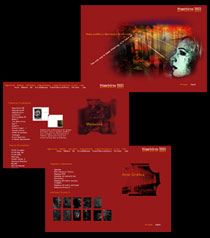
Hiperborea with some real navigation structure and some thought put on design.
Remembering the versions before that, I realize now how it was a big leap for
me at that time.
The
99 version was more focused on texts and how they would be read by the people.
The layout was quite clean and easy to navigate. The major drawback was how
people would steal your texts easily at that time. Since then i took all my
stuff from the web, at least from my personal site. I kept sending reviews and
stuff for other people, and hoping they could hand better with those kinds of
thiefs. I never had a problem with people getting some of my texts and putting
on their sites as long and they put the otiginal author on it, wich was not
happening at that time.
2001
was a rough year. Quite busy too, actually. So i had to work a lot as freelancer,
despiting having a day job. So i made a new version of Hiperborea, now with
more personal info (maybe too personal), and as a portifolio, so i could reach
a bigger audience to the work i do. Also in this year i started to change my
agenda a little, and wanted to also become a graphical artist and not just designer.
At
2002 the site got a new layout and became less personal than it´s previous
version. This structure here changed very little the 2002 site. Besides, was
the first version to really have a english version fully functional.
The
Fábrica was made as a virtual company site, to be a portifolio for me
and Tatiana Móes, wich I have been working since we left Radar9.
The
Ansible was a university project. The idea was to design a Sci-Fi e-zine with
lots of "traps" and easter eggs all over it. It was hard to navigate,
but somewhat, fun too.
Mariana
Borges, a partner at Radar9, suggested as a second source of incoming for the
company, that we should run a site with local news about movies, book, art and
stuff like that. The suggested name was PE360. Later, i asked her to use such
name, but as BR360 and i inveted some people to do this, but in a much greater
scale, over Brazil itself. With the lack of resources, however, people wasnt
really motivated to work on it.
The
Concha (shell) was a very simple website i did for a friend, Aline Cordeiro,
coordinator of this Journalism students e-zine.
The
Copergás website was very close to have a cow. The concept wasn´t
simple and out channel of communication with the client was pretty much jammed
by some partners that simple coudn´t give us the right information about
what he wanted. Tatiana left Radar9 just a bit before we finish the project,
totally burned out by the situation. I left just a few months later, to join
her as two crazy nuts that can´t be easily cracked. :)
Our
first work together after the we left Radar9, Taty and I have a pretty good
time arguing. Was fun when i remember it, but was also a pain at that time.
In the end we agree on the design and the client also loved, so it was a happy
ending. :)
The
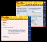
Cupido was a layout suggestion for the website with the same name, hosted at
Pernambuco.com. This is one of the three versions shown to them.
ExperTI
was a intranet page for the Facilit company, a Borland fringe company in Brazil.
GenTI was a labor pool site designed specially for pragramers. It drwwed people
from the other Facilit sites that usually rated them for how good they are at
wich language. Was a interesting thing, since the employer would already know
how good someone would suposedly be before even having to make a test itself.
Infornordeste
is a big computer con in Brazil and ths was the first major website designed
and executed by Radar9. We trade it for a booth at the con and was a nice deal
since we got a good number of contacts. The wesite itself was kind of clunk,
and not much intuitive, but we learn only with our mistakes.
OA
very clean layout, as requested by the client, the IPPP website was just a few
pages long, with the names of people associated to the IPPP, a paranormal study
institute. Why I always get the weird stuff? :)
That
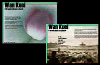
would be a Kindred of the East website for a LARP game run at my city. The idea
was to picture Chine 80 years ago, and put character sheets and stuff on it.
ASame
LARP stuff, but now the Malkav website. Was design to look simple and to resemble
a madman room in a hospital, but wit splashs of color.
The
major site of Facilit, the Mundo Delphi was a place to put resources about delhpi
and other Borland programs and apps. This was the second project that kept busy
for more time after conclusion, since i was hired to keep the site going with
small updates, banners and similar things.
The
new layout for Mundo Delphi, wich was never really implemented. Another layout
had replaced the first one, but was thought than this here and had a really
bad feedback by the users. Sumin up, to know and work as Designer cant be mesured
by yours graduation exclusively, but also for direct working with the thing
and understanding the users youre aiming for. Poor designers never realize that
and the formulas that they work for everybody is just not tailored enough for
each public.
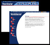
I
enjoy a clean design, but this one was too clean. Anyway, the amount of info
was really sttagering, so i dont have many options on it. It was the site for
the Vestibular that was connected to Pernambuco.com. All newspaper usually have
a site or hotsite for it, since Vestibular is a big event around here (is a
exam that test you for university).
After
being fired from Diga-Me.com with the whole team, actually, i was conctacted
by my ex-boss, Etiene Ramos to work on a website of her husband. The website
was visually terrifying, ugly as hell, but it put it´s trash concept as
something their fans wanted. So, what was the job? To keep it with a grain of
Trash, but also to make it very attaractive and functional. I called Tatiana
Móes and we worked hard on it, and the final result was really pleasant
for us, the vclient and the users, that keep coming more and more everyday.
Was by far the peoject i followed for a longer time, and i still make one thing
or another for it. Give yourself a look, the O
Recife Assombrado didnt have a english version, but it gives one idea of
i like to do.
Radar9
website was excuted by Ricardo Valença following the design plan done
by yours truly and Tatiana Móes. The idea was to connect the word Radar
literally, and them we have some animation and pictures of WW2 airplanes and
airplanes crew.
Was
a new layout proposition for RPG em Revista, a RPG e-zine I had worked with
for sometime.
Snakes,
snakes and more snakes, was the "day special" when i ahd to design
a Setite website for the LARP here.
The
Shattered Ramains was a multi-country project to have a website that would deal
with all things horror. It didnt really take off due to lack of resources and
time of the people involved, but was nice to work on it and would be really
fun.
Toreador
website designed for the LARP project around vampires. The website was done
with lots of roses and Waterhouse art blended in. Was really pretty. Never got
finished since it lacked the content that would be provided by the LARP players.
My
proposition for a Unknown Armies website. Malcom Rosen would host the new layout
but them he had some personal problems and the project just sink. I will keep
this layout for a future UA-BR list website. It´s the kind of layput that
will not get old so soon, and i really enjoy it.
The
Web of Lies was ny firt online art galery, mostly based on works of Clive Barker
as inspiration.
Cqueiroz Comunicação website. That´s an old version of the
layout, and still didnt have the time or the will to make the trip to get my
stuff that have statyed in the company.


