


"Now we see but a poor reflection; then we shall see face to face." I Corinthians 13:12a
Sample Layouts with step-by-step instructions


Usually I make my pages based on the photos I'm using, but I occasionally get inspired to make a page just for fun. That's what I've done here.

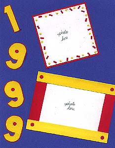
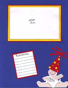
Happy New Year! It doesn't seem possible that it could be 1999! I wasn't sure how this page celebrating the new year would come out, but I really like it! I used bright colors of yellow and bright pink, then placed them on a blue cardstock background to really make them stand out. The numbers were traced from some stencils I've had forever, the kind you find in the school supplies aisle. I traced and cut them from yellow, then mounted them on pink and trimmed around them. I punched a circle from pink using a regular hole punch, and used that for the middle of the 9's. The New Year's baby came from the Pebbles baby tracer. I cut it out from very light pink paper, and the diaper from white. I free handed the sash, and wrote "1999" on it with a silver Pentel gel writer. The hat is a die cut, which I traced onto pink and trimmed down to fit the baby better. I decorated it with yellow circles punches from two different sizes of hole punches. The photo mats on the right are yellow and pink, and I've lined one of them with silver so that it's all ready for you to write in your New Year's resolutions! The confetti look on the mat on the left was made with a hole punch from yellow, and tiny snips cut from a strip of pink. For the lower left mat I cut 2 strips each of yellow and pink and placed them around the mat. I punched circles from pink to liven up each corner, and I had a neat look that was so easy!

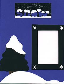
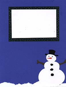
For those of you in the midwest and east still digging out from the piles of snow that the new year brought, this page is for you! I used medium blue cardstock as a background to really set off the white snow, along with dark green as an accent color. The letters are from a Pebbles tracer, traced onto blue, then layered with white to top it with snow, and mounted on dark green. I used a Zig opaque writer with a fine tip (forget the extra fine--I can never get them to work!) to write "Hooray for" and add dots to look like snow falling, all on the title section. I also tore a thin line of white paper and mounted it over the very bottom of the letters. I used the same torn paper technique at the bottom of the page. The tree and the snowman are die-cuts, which I recycled by tracing them onto the colors that I needed and cutting them out. I cut the tree from dark green and white, the trunk from brown. I then freehand cut off the top of the white tree and layered it over the green. I cut the snowman from white, his arms from brown, and his hat from black. I freehanded the carrot and lumps of coal, and used a black Zig writer for the eyes. The photo mat on the left is made from strips of dark green layered over each other to make a rectangle, accented by a white snowflake punch in each corner. The mat on the right is dark green, dotted with a white Zig Opaque writer to look like snow. I've left some open space near the snowman, which would make a nice spot for a third picture.
NOTE: If the above pages don't look like they're the same size on your browser, it's an error I made in scanning them. I haven't taken the time to go back and fix them, but be assured that they are both true 8.5 X 11 pages!

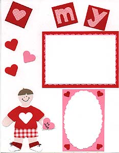
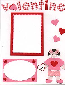
If you've seen the great scrapping magazine Along the Way (now called Pebbles in My Pocket Magalog), then the paper dolls on this page might look familiar. Then magazine has really cute examples of paper doll ideas in every issue, and they were my inspiration for this page.
I die cut the paper doll pattern and clothes from my local SB store. Because I wanted to be able to use them again and again, I traced them onto very pale pink to make the dolls for this page, then cut them out. I cut the boy's shirt from red, and layered it with white to give the collar and sleeves some extra color. I cut his shorts from large gingham check in red, and I freehand cut his socks (in red), shoes (in white), and hair (in lt. tan). For the girl, I cut her shirt from pink, layered white behind the sleeves, neck and bottom edge, and used my ripple scissors to cut the white edges, giving a lacy look. Her shorts are pink with white polka dots, also with white "lace." Her shoes are freehand cut from pink, and her hair from medium brown. The tiny hearts on her shoes came from a border punch I have, and the bows in her hair were made with a bow punch in the same pattern paper as the shorts. The hearts on both dolls, and the Valentines they are holding are from a medium heart punch. I mounted the Valentine one onto a different color, then cut around it with decorative edge scissors(ripple & mini pinking). I added details and writing to both dolls with a black Zig writer.
Whew--now for the rest of the page! The letters were made with a Pebbles stencil, cut from pink and large red gingham check. I mounted the pink letters on red squares to make them stand out more on the white background, and I substituted a heart for the letter a in "valentine," as well as a red i with a small heart punched for the dot. The mats for the rectanglular photos were first done in pink cardstock, then cut close to the edge with my ripple scissors. They were then matted again with red, this time with a larger border. I cut the mats for the oval photos with my ripple scissors, then mounted them on pink rectangles and dressed up the corners with red hearts punched from a small heart punch. I also used punches to dress up the borders, using a medium heart in pink and red, as well as one punched from the pattern paper used for the girl's shorts, then mounted on a red square.
This page took a little longer than usual, and took more tools and goodies than I usually use for this page, but I love the way it turned out. Be sure to check out the Pebbles in My Pocket Magalog for more paper doll ideas. The second half of their magazine is their catalog, and their products are fantastic. Apparently with the next issue (Spring 99) they will be offering the paper dolls as die cuts and templates. The number for Pebbles is 1-800-438-8153.

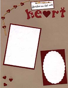
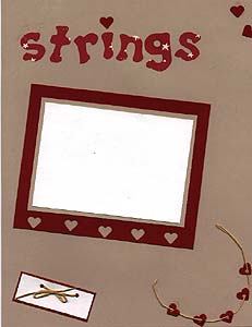
I got my inspiration for this page from a recent issue of Creating Keepsakes magazine. They always have an article about using borders on your pages, and in this particular issue the author used small punched hearts on a string as a border. I thought it was a cute idea, and adapted it to use on this page.
The background is a light tan color, which I like to use because it adds color without being overwhelming. The letters are from a Pebbles in My Pocket tracer, traced and cut out of pattern paper by Over the Moon Press (I think). To go along with the heart theme, I punched a medium heart from red cardstock and used that for the letter a in "heart," and I also used a small punched red heart to dot the i in "strings." I punched several more small hearts from red cardstock, punching 1/8" holes in the center of several to "string" them. For string I used raffia (yes, I tested it and it is acid-free), threading it through 5 or so of the small hearts and adhering each to the page with a Zig glue pen as I went. I put one string in both the uppper right and lower left of the layout. I scattered small punched hearts in the other corners to give it continuity. For the photo mats I used red cardstock, using ripple scissors around the white oval mat. I dressed up the mat on the right by matting with tan first, and leaving an extra wide border of red at the bottom for some heart punches. I matted two short strips of white cardstock on red, first making two 1/8" punches in each, threading them with raffia and tying a bow. I used one of these to write "families are tied with" and mounted it above the "heart" title, so that the whole title would read "families are tied with heart strings." I mounted the other box with the raffia bow at the bottom of the opposite page, leaving it blank. It's the perfect spot to journal the date, location, or whatever from the photos used.

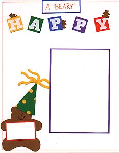
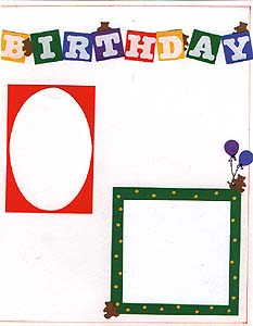
Hmmm, I was stumped on what to do for a March page, finding little inspiration in kite flying and/or lions and lambs at this time. So, since my daughter turned 3 on the 6th of March, I decided to do a fairly generic birthday page that could be used for anyone, in honor of her birthday. It's really a simple page--I left lots of room for more pictures, journaling, or just embellishments that the winner might want to add.
I started by drawing a simple line border 1/2 cm. around the edge of the pages with an orange Zig writer. Then I mounted white sticker letters from Making Memories onto squares of different colors of cardstock to spell out "Happy Birthday." I wrote the words "A 'BEARY'" in orange on white, then mounted it on blue and placed above the "Happy" in the title, so that the whole thing reads "A 'BEARY' HAPPY BIRTHDAY." I punched small bears from lt. brown cardstock and placed them on top and to the sides of some of the letters. I used a template from C-line for the large bear, cutting him from lt. brown cardstock as well. I sized down a die-cut for his hat, cutting it from green cardstock, layering it with yellow, and adding yellow punched circles. I cut a small rectangle from white, matted it with orange, and had the bear "hold" it. It's the perfect spot to identify the birthday person, year, or whatever. I used purple for a photo mat on the right, leaving room for a 4 X 6 vertical photo. For the mats on the right, I matted an oval shape with an orange rectangle, and matted a 3 X 3 square with green. I punched small holes in the green mat and backed it with yellow so that it is polka-dotted, then placed a couple of punched bears in the corners, one holding some punched balloons.

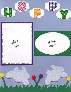
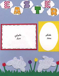
Happy Easter to everyone! Though Easter means a lot more to me than bunnies and flowers, I used them as the theme for this month's layout. It's an easy, fun page to do.
I started by using a pale blue cardstock for the background. I then used a spring green color to hand cut grass and adhered it to the bottom of the page. I used a Provo Craft template for the bunnies, cutting them from a self-adhesive white felt. It's called Presto Felt and I bought it at Jo Ann Fabrics. It tested as acid-free, though it's not labeled as such, and I think it adds a neat texture to the page (in addition to being really easy to stick on!). I used my small balloon punch for the flowers, making a snip in the top to make them look like tulips. I punched them from yellow, bright pink, and purple cardstock and hand cut the stems from spring green. I used the Frances Meyer fat caps lettering template for the letters, cutting them from coordinating bright pattern papers that I had as scraps. Using an oval template, I traced 11 small ovals onto white cardstock, cut them out with my cloud edge scissors and placed the letters on these "clouds," putting them at the top of the page for my "Hoppy Easter" title. I also used my black Zig writer to add stitches around the letters, making them stand out a little. For mats I again used the bright colors of purple, spring green, bright pink, and yellow, using both rectangle and oval shapes. An easy, fun Easter page!

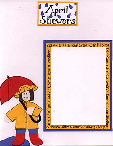
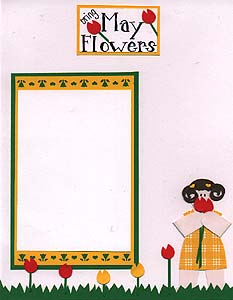
Who can resist those adorable paper dolls that are so often featured in the Pebbles Magalog and Paper Kuts scrapbook magazine? I sure can't! They are fun to make, easy to work with, and make the cutest addition to a scrapbook page! Here's how I made this page . . .
I began with a white cardstock background, and kept it simple with only two photo mats. The first I matted in yellow, leaving a wide enough border to write the words to the children's song "Rain, Rain Go Away" around the edge. I then matted it again in blue. I used a black Zig writer for the title "April Showers," and accented it with raindrops, which were made by punching small hearts from blue and then cutting them in half. I matted the title with yellow. For the April Showers paper doll, I first cut the doll from very pale pink cardstock. I freehand cut the raincoat and hat from yellow, the jeans from blue, the hair from brown, and the boots and umbrella from red. I layered the boots with a small strip of black, then cut it with my deckle scissors to give the boots their tread. I added accents with my Zig writer, and freehand cut a puddle from blue for the doll to stand in.
For the May Flowers side, I matted the spot for the photo with yellow, then punched the bottom and top edges with my hearts & flowers border punch, double matting it with green. I again lettered the title with my black Zig writer, adding tulips by cutting a snip out of a small balloon punch and adding a green strip for the stem. I matted the title on yellow. For this paper doll, I again cut her out of pale pink, then cut her dress out of a yellow check pattern. Her hair is brown, and her ringlets were made using a spiral punch. The tiny hearts in her hair are from the border punch that I used on the photo mat. I freehand cut the grass, and again made the tulips using a balloon punch in red and yellow with a snip cut out of the top. I also made the doll hold a couple of the tulips, folding over her arms so that she could hold them.

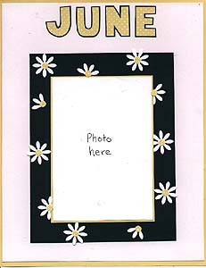
 Here's an easy, fun layout for June. I just used pattern paper, cardstock, and a daisy punch for this page. I started with my one of my Pebbles letter tracers, tracing the letters onto buttercup pattern paper from D.O.T.S., then mounting them on dark green and cutting around them. I used white for a background, trimming a little off each edge and mounting it on buttercup paper from D.O.T.S. I made space for just one photo on the left, choosing instead to really bring it out by matting it first in buttercup, then in dark green with a large border. I punched several daisies from white, trimming some of them, and scattered them on the green mat. The centers were punched using a 1/4" hole punch.
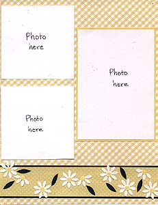
 For the right side of the page I chose a coordinating pattern paper from D.O.T.S. as background, and left space for 3 photos, matting one of them with buttercup. I cut a strip of pattern paper to match the letters on the opposite page and backed it with dark green, then placed it at the bottom of the page and scattered punched daisies and leaves on it. It offsets the daisies, colors and patterns on the opposite page without looking too busy.

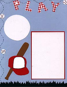
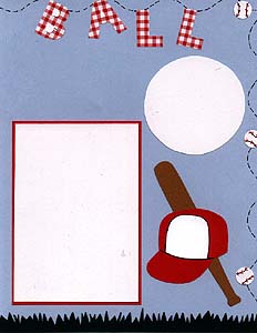
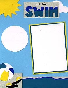
I'm always open to suggestion for page layout ideas, and last month someone requested pages for Little League or Tee Ball and swimming lessons. I thought it was a great idea, so I created pages for both. Since there are two different layouts, we'll have two winners this month. Please enter as usual, and I'll draw two names instead of one.

For the "Play Ball" page, I started with a light blue background, like the sky on a bright summer day. I used dark green and hand-cut grass for the lower border, and cut the letters from red gingham using a Pebbles letter tracer. I punched medium circles from white using a circle punch, and placed these randomly around the border of the page, using my Zig Writer to add detail and make them look like baseballs, as well as adding dotted lines between them to give the look of motion. I used both circular and rectangular photo mattes, bordering the rectangular ones with red. The bats are hand-cut from a shade of tan, and the hats are a die-cut from Accu-Cut, which I layered with red and white and added detail with a Zig Writer. Hopefully there's enough white space on the hat for the winner of this page to fill in the name of the team, the year played, or some other journaling. There's also room on the page for more journaling below the letters, or one of the circular mats could be used for this purpose. I have some small baseball stickers from Provo Craft that will also be included with this layout.
For the second layout ("In the Swim"), I again used light blue for the background, though this time a slightly brighter shade. I saw an idea similar to this one in the Pebbles Magalog and liked it, so I adapted it and love how it turned out! I freehanded the water, layering it in two different shades of blue, then putting a grey strip behind and to the left of it to look like a pool deck. I hand-cut the ball and sandals and placed them on the "deck." The letters are from a Pebbles letter tracer, layered in two shades of blue and placed on grey with additional lettering handwritten above. Behind the lettering is a die-cut cloud and in the upper left a die-cut sun, both from Accu-Cut. I have one circular and one rectangular photo mat, with the larger one double-matted in turquoise and yellow. Water drop stickers from Mrs. Grossman's will accompany this layout.

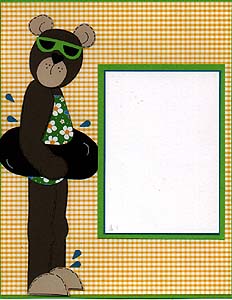
Have you tried paper piecing and seen the great patterns from Windows of Time? Paper piecing is to scrapbooking what patterns are to quilting, and actually is based on the same principle. What you have with a paper piecing pattern is a picture of the finished product (the bear, in this case), then the pieces of the product broken down (the legs, arms, feet, ears, etc. are separate pieces). The pattern is meant to be copied (or traced), cut out, and then traced and cut out onto whatever color paper you choose. This particular bear is from the Windows of Time Bear Patches book, which has a different bear for every month. This is "Sunshine," the June Bear. Windows of Time also makes paper piecing patterns for just about every theme you can think of. They are easy to use, and turn out so cute (especially for someone like me who can't draw a straight line!)
I used a yellow gingham paper from the Paper Patch for my background on the left page, and backed it with spring green cardstock. I used brown and tan cardstock for the bear, pattern paper from the Paper Patch for her bathing suit, black for her inner tube, and green for her sunglasses. The bathing suit, inner tube, and sunglasses are also part of the paper piecing patterns. I used a black Zig Writer to add stitch marks all along the bear, and I made a couple of accents with a white Pentel Milky Gel on the inner tube. The bear's nose is a black punched heart, and the water drops are from a small heart punch cut in half. The photo mat is intended for 4 X 6 vertical photo, and is double matted in turquoise and spring green
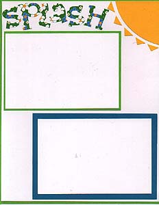
I chose white as a background for the right page, because the left side is pretty busy and I didn't want the background to overwhelm the photos. I backed the white with spring green cardstock, and cut a sun from yellow for the upper left corner. The rays of the sun were made by using a small square punch and cutting the squares in half. The "splash" title is from the Frances Meyer Funky template, cut from the same pattern paper as the bear's bathing suit. They photo mats are for two 4 X 6 horizontal photos, one matted with spring green and one with turquiose.

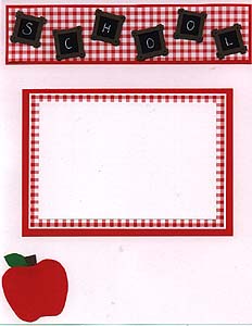
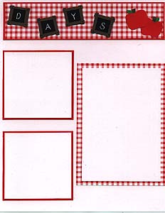
Did you remember to take pictures of your little darlings on their first day back to school this fall? If so, this page may come in handy! If not, take pictures tomorrow and just pretend you took them on the first day, and you'll have the perfect pics to go along with this layout as well.
I kept this page simple, choosing a white background, one main color, and a couple of accent colors. For the page title, I matted large red gingham paper from the Paper Patch with red cardstock, cut in a strip slightly smaller than the width of the page. I cut small black squares of approximately one inch, and bordered each with four small strips of brown for a chalkboard look. I used a white gel writer to spell out "SCHOOL DAYS" on the squares, and made a black dot in the corners of each to represent nails holding it together. I mounted the letters on the title strip, and since I had a little room left over on the right side after "DAYS," I used my Pebbles School Days tracer to add a couple of small apples in the upper right, layering red, brown, and green cardstock. I carried the apple theme to the left side by again using my Pebbles tracer to create a larger apple from cardstock which I placed in the lower left corner. I then placed one horizontal photo space, triple matted in red gingham, white, and red cardstock on the left side, leaving plenty of room at the bottom of the page for journaling. On the right side I matted one vertical rectangle photo space with red gingham and placed it to the right of two square photo spaces, matted with red. The letters for the title took a little time, but were easy, making this a simple and fun layout!

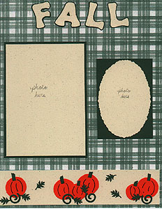
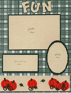
Wow, for some reason this month's layout had me stumped! I had an idea of doing a nice fall-themed page, but for some reason couldn't come up with anything concrete and kept putting it off. Finally I put this one together on the last day of September! I adapted the border from one I saw in an old issue of Along the Way magazine, which has since become Pebbles in My Pocket Magalog, which is now no longer publishing. Whew--talk about confusing! Anyway, the border idea is from their "Border bound" section.
The background paper I chose for this layout is from Provo Craft. They have a neat new line out called Soft Watercolor background paper, and it is fantastic! The patterns are muted and not too busy, and the colors are, well, soft watercolors! This particular color is pineneedle green. I had a perfect shade of green cardstock to compliment the background paper, so I used that to mat my photo and journaling spaces, as well as for lettering and accents on the border. I used a speckled cream color for the border, photo spaces, and title. The letters for the title are from the Pebbles hand-drawn lettering tracer. For the border, I used a circle template to trace two different sizes of pumpkins, and added accents with a brown Zig writer. I cut a thin strip from the green cardstock and used that for pumpkin stems, cutting them off with my deckle-edged scissors. I also punched small oak leaves and small spirals from green and used them for pumpkin vines and leaves.
It sure did take me awhile to dream up this one, but once I got started, it was an easy page to do, and I am pleased with the results. Hopefully some pumpkin patch or leaf raking pictures will be the finishing touch for the winner of this layout.

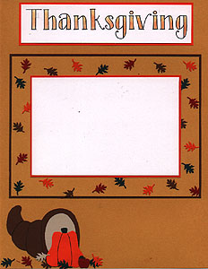
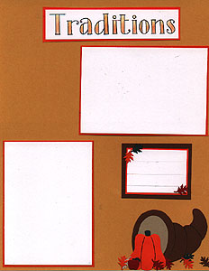
I always struggle with new ideas for Thanksgiving pages, because the stickers and die cut selection for this holiday seems to be pretty limited, and I haven't had any luck freehanding a new version of a turkey or pilgrim! This year's layout went together pretty easily, though, because I focused more on the rich colors of fall than on any particular theme.
I chose a pretty maize-yellow color for the background. It works well in expressing the mood of the season without overpowering the pictures. I traced two cornucopia die-cuts onto dark brown, layering them with a lighter brown center and placing them at opposite lower corners of the layout. I used a Provo Craft template for the pumpkin, first reducing the size via my scanner and tracing it and cutting it out from orange, with green for the stem and a black Zig writer for lines on the pumpkin. I punched 2 apples from dark red and brown, layering them for a red apple with a brown stem. I punched small oak leaves from orange, dark red, dark green, and light and dark brown and placed the punched shapes around the cornucopia. On the left hand side, I left a space for a horizontal 4 X 6 photo, giving it a thin orange mat, a thick maize mat, and a thin dark brown mat. I then randomly scattered more punched leaves on the yellow mat. On the left side, I left space for two 3 1/2 X 5 photos, one vertical and one horizontal, and I gave each a thin orange mat. I also matted a small rectangle in orange and dark brown and drew lines for journaling, finishing off with more punched leaves for accent.
For my title I tried out something new. If you're like me and can't draw a straight line, you've shyed away from creative lettering, choosing instead to utilize templates and letter stickers. That was me, until I broke down and invested in a couple of lettering CD's produced by Creating Keepsakes Magazine. Each volume includes 15 true-type fonts which load onto your computer's word processing program. I got my CD's about a month ago, and have been having so much fun with them! This title was created using Volume 1, it's called "Anything Goes." I printed it out in black and white, then used two different colors of colored pencil to fill it in. To get the colors to blend, I first used the darker color, then colored over it with the lighter color. I matted both title blocks in orange.

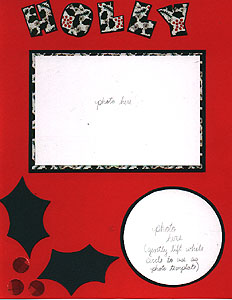
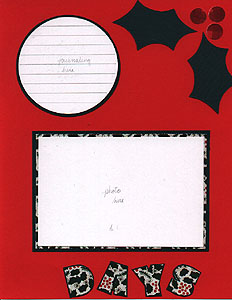
Happy Holly Days! I kept the theme super simple for this month's layout. Nothing fancy, but still a nice page for those holiday photos. I chose a festive red for the background. I usually like to stick with more neutral colors for the background, but since my embellishments for this page were pretty simple I thought a brighter background was more in order this time. I cut the letters "holly days" from holly-themed pattern paper by Scrap-Ease. I used my Frances Meyer fat caps template for the letters, placing them on dark green after cutting them out and cutting a thin border around them to make them really jump our from the red. I also used the holly paper to mat the two larger photo spaces, then double matted them with dark green. I matted two circles in dark green as well, leaving one for a photo, and drawing light lines on the other for a journaling space. To finish the layout, I placed die cut holly leaves from Accu-Cut in opposite corners, and punched berries using a circle punch and red plaid pattern paper.
To all who visit this web page, may you and yours have a blessed holiday and a Happy New Year. Don't forget to take lots of pictures! See you in 2000!

Be sure to check out these other areas:
Scrapbook home|
Scrapbook product review|
Scrapbook page ideas|
Scrapbook savings|
Scrapbook beginner's guide|
Scrapbook layout index|
Scrapbook links

Alexi's Room|
Barbie's Room|
Henry's Room|
Truman's Room|
Home|
Virtual Scrapbook|
E-mail me
2000

1999

1998

1997

1996

Alexi's ABC book
