


"Now we see but a poor reflection; then we shall see face to face." I Corinthians 13:12a
Sample Layouts with step-by-step instructions


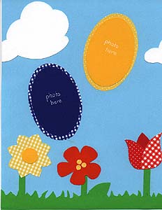
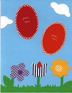
I created this page to show what can be done with just a few scraps of paper and a template. I used a Provo Craft template, and traced parts of the flowers out of patterned paper to give them a fresh look. I cut a strip of green paper, then snipped at it with my scissors to make it look like grass. The leaves and stems came from the template, and the clouds are die cuts that I traced. I cut ovals (again traced from a template) from different colors of patterned paper, then cut coordinating solid ovals one size smaller. This is where my photos will go. This page is general enough for just about any spring or summer pictures, provided they aren't too busy and are appropriate for an oval shape. Journaling could be done in the clouds or around the ovals. Possible titles might be:


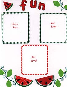
Though the summer is drawing to a close, if you're like me you still have tons of summer pictures to scrap. Here's a layout that's perfect for those end-of-summer picnic shots! I used green and red gingham rectangles with rounded corners to mat the photos, and added watermelons for accent. The watermelons were simple to make: I traced circles from a template onto both solid and polka-dot red paper, and then traced more circles a size larger onto green solid and print paper. I mounted the red circles on white and cut slightly larger circles around them, then mounted those on the green. To make slices I just cut the circles in half, then cut one of the halves into thirds. I used a small heart punch (cut in half) for the seeds, and used a white milky gel writer to add accents. The letters are traced from one of the Pebbles tracers from Pebbles in My Pocket. I filled them in with red, traced them in green, and added black "seeds." A leaf punch and wavy lines in the corner completed the look.
Once again this was an inexpensive page to make (they always will be here, since I'm giving them away!). I had the scraps of printed paper, lettering and circle templates, and heart punch. I went to my favorite scrapbook store and borrowed their leaf punch, but that's the only thing I didn't have on hand.

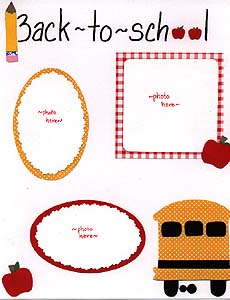
It's that time of year again--the kids are
back in school! Whether your little ones are getting on that big yellow bus for the first time or are old pros at the schoolyard scene, this page will work for photos of those first days back. I used the Pebbles in my Pocket school template for the bus, pencil, and large apples. I traced the school bus onto yellow polka dot paper, then added black for accent. I traced the apples onto red cardstock, cut off the stem and leaf, then glued on a brown stem and a green leaf. For the pencil, I traced it several times: yellow for the body, tan for the tip, silver for the band, and pink for the eraser. I cut the tip off of the yellow body with my deckle scissors and glued the brown tip behind it, coloring the point black for the lead. I also layered the silver and pink papers under the yellow, cutting off the parts that wouldn't show so it didn't get too bulky. The small apples in "school" are punches, which I punch both from red and brown and layered, then added a scrap of green for the leaves. The mat behind the square photo space is red gingham, while the ovals are yellow polka dot and red. I also used a scallop edge scissor on the ovals. I used templates for the ovals and the square. The title is lettered with a black Zig writer.
Once again this was an inexpensive page to make (they always will be here, since I'm giving them away!). I had everything on hand, from the templates and punch to the paper scraps and the pen. It's a pretty simple page, but could easily be dressed up with a few stickers and some journaling.
In case you're an individual who holds a tight reign on the acid content of her pages, have no fear. Everything I've used in creating these sample layouts is photo safe. All papers are acid-free, lignin-free, and buffered. All adhesives and pens are archival and permanent. With this in mind, these pages will in all likelihood be around longer than I will!

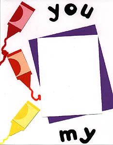
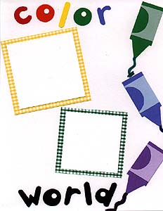
This was such a simple, fun page to do! I used my Pebbles Tracers from Pebbles in My Pocket for both the letters and the crayons. I traced the letters (from the "rounded" tracer) onto cardstock, and used white circles punched with a hole punch for the insides of the o's and d. I traced the crayon (from the "school" tracer) onto brightly colored cardstock, then traced the inside part onto cardstock in pastel shades of the same colors, layering them to make them look like the paper on a crayon. I used the bullet tip of my Zig writers to draw a line coming from each crayon. I backed the squares for photos with yellow & green gingham, and used a larger rectangle on the facing page, with an even larger purple rectangle skewed at an angle behind it.
Once again this was an inexpensive page to make (they always will be here, since I'm giving them away!). I had everything on hand, from the templates and punch to the paper scraps and the pen. It's a pretty simple page, but could easily be dressed up with a few stickers and some journaling.
This page could be used for just about any pictures, but when I created it I had in mind pictures of a child coloring. Those pictures could be placed on the right hand page, while the larger space on the left could hold the picture that the child drew.

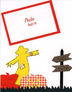
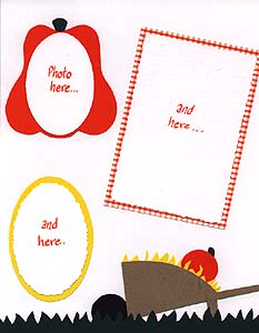
This is a variation on a page I have in Alexi's second year scrapbook. Fall is one of my favorite times of the year! We got some neat pumpkin patch pictures last year, and the page I did with them is one of my favorites. This one is similar to it. I used several different templates, as well as a couple of die cuts. The scarecrow is a die cut, which I added scraps of pattern paper to as patches. I went around the patches and scarecrow with my Zig writer to accent it and give it a country look. The large pumpkins by the scarecrow are also die cuts--one from orange cardstock, the other from orange gingham with yellow behind it for the jack-o-lantern. I hand cut the sign post, wrote "pumpkin patch" and "hayride" with my Zig writer, and added tic marks to the signs to make them look like wood. The pumpkin that mats a photo on the right hand page is from the Provo Craft fall template, traced onto orange and dark green and layered. The wheelbarrow is also from a Provo template, I believe it is the garden one. I traced everything but the wheel onto brown, then did the wheel on black and layered them. I hand cut the hay and the small pumpkin. The grass is from the Pebbles garden template, traced onto dark green. The large photo mats are orange cardstock and orange gingham, and the oval shaped is yellow cardstock. I also used my deckle scissors to cut some of the mats.
While I try to always do these pages using templates that I have on hand, for this one I had to branch out a little and use some die cuts purchased at my favorite scrapbook store. I usually trace the die cuts that I buy, though, so that I can use them as templates again and again (how's that for a money saving tip?)

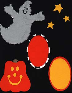
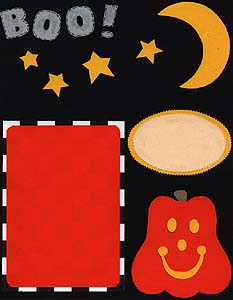
Well, I'm not big on Halloween, but this page was fun to do. I used a Provo Craft template for the pumpkins, moon, ghost and stars. The letters are from the Frances Meyer "fat caps" stencil. The moon & stars were traced on yellow cardstock, the pumpkins on orange with the features in yellow and the stems in brown. The ghost and letters were traced on vellum paper so they look kind of transparent. I used my black Zig writer to fill in the details and add tic marks around them. Large black & white checked paper was used to mat the large rectangle and one of the ovals, and yellow and orange cardstock was used for the others. I had everything on hand as scraps, so this page was cheap, easy, and fun!

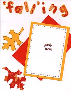
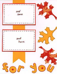
This is not my favorite layout of those I've given away, but it still makes a nice spread for fall pics. I'm struggling with these fall layouts, because I live in the south and it just does not seem like fall here! For this page, I used my Pebbles letter tracers, tracing the word "falling" onto leaf patterned paper, mounting the letters onto yellow cardstock, and trimming around the letters. I cut the words "for you" from yellow cardstock, mounted it on orange, and trimmed the letters again. It's more work to trace, cut, then cut again, but I think the result is nice. From a die cut that I already had, I traced the oak leaves onto yellow cardstock and leaf print paper. I used a brown Zig calligraphy marker to add tic marks to the yellow leaves, making them stand out a little more against the white paper. Yellow and orange mats were used for the photos, and I used a strip of yellow behind the spot for pics on the left, for a ribbon effect. Other than cutting out the letters, this page was quick and easy. It was also cost me nothing, as I used scraps and supplies that I had on hand.

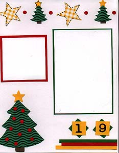
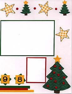
Wow--Christmas already??? Here's a page that's perfect for those pictures of the family gathered around the tree. The best thing about this page is the neat paper I used to make the trees. It's corrugated, like cardboard, so it adds some dimension to the page. It's from a company called Paper Adventures, and I'm pretty sure it comes in a variety of colors. I used the Christmas tracer from Pebbles in My Pocket for the large trees, accenting them with a brown trunk, yellow star, and red Christmas balls punched from a regular hole punch. The small trees are from a template from Memories Forever. I did the same thing with them, minus the balls (glueing those tiny shapes gets tedious!) The large stars are traced from a star template by Plaid. I traced them onto yellow gingham, then added tic marks with my Zig writer to make them stand out. I also added a red circle punched from a hole punch between the tiny trees and stars, just to add a little variety. I cut small squares in yellow and green cardstock using my paper trimmer, then mounted the Frances Meyer number stickers on the yellow ones to make the year. I rotated the green squares behind the yellow and mounted them at the bottom of the page. I had a little extra white space and some scraps of cardstock in perfect strips, so I put these below the number squares to add some color to the bottom of the page. I left space for two 4 X 6 photos and matted them with green cardstock, and a space for a smaller square photo is matted in red cardstock. I also matted a small rectangle in red, which could be used for journaling or another photo.
Another fun, simple page that you can make for practically nothing. I'm not sure how much the corrugated paper costs, because I got mine free as a promotional deal, but it certainly isn't necessary if you can't find it. Plain green cardstock would work just as well, or green gingham would add a textured touch. Besides, if the paper is flat, it would be a whole lot easier to get those darn dots to stick! Have fun re-creating and adding your own personal touch to this page idea!
To see more layouts, check out the 1999 archives.

Be sure to check out these other areas:
Scrapbook home|
Scrapbook product review|
Scrapbook page ideas|
Scrapbook savings|
Scrapbook beginner's guide|
Scrapbook layout index|
Scrapbook links

Alexi's Room|
Barbie's Room|
Henry's Room|
Truman's Room|
Home|
Virtual Scrapbook|
E-mail me
2000

1999

1998

1997

1996

Alexi's ABC book
