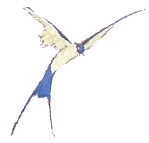
The effective use of drop shadows can really enhance your work, here is a bird from my object library on a plain white background.

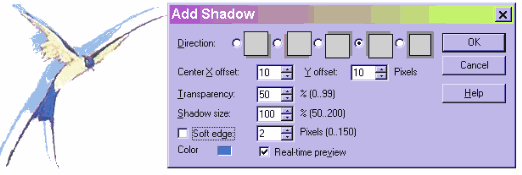
Look what happens when I add a simple drop shadow, it lifts the bird right off the page. Generally, shadows look most natural with a soft edge and some degree of transparency.

The shadow will indicate the origin of the light. Here I have put the shadow to the left and above the bird, I changed the color to the blue picked up out of the bird with the eyedropper, and unchecked Soft edge. It looks like the light source is to the right of the bird and downward. With Real-time preview selected you can try out different effects to find one that you like.
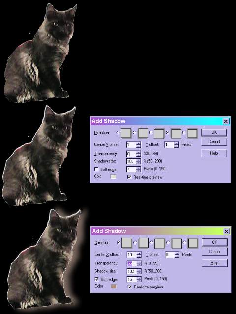
Question--when is a shadow not a shadow. Answer--when it is a highlight. You can also use the shadow creator to create a highlight. Here I have put my favorite kitty on a black background. He doesn't show up very well. So, first I will add an almost white "shadow" upward and to the left, offset just 1 pixel each way, with 0 transparency and no soft edge. This gives me a nice sharp edge against the background. Then I add a second shadow, much softer to the right that looks a little like hazy light.
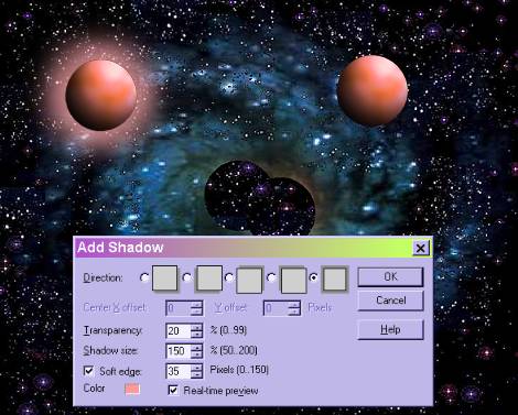
You can also add shadows to text. If you simply right click and select Add Shadow you will get the default shadow with no selection box popping up. You can, while you are in Text mode click on Options up on the tool bar and you will be able to select the same options available on a shadow on an object. If you save as a transparent gif you cannot use a soft edge or you will get unwanted background color outside your shadow. Here are two examples of text to which I applied the red woven texture, Hue shifted the color to purple, applied the 3D effect. On the first is a shadow with a soft edge, second one has no soft edge.
