Flags are a world institution. From the little kid
given his first tiny flag at the Ashville Fourth of July Festival, to the hemp
activist lighting a flag on fire with his residue encrusted lighter, flags touch
our everyday lives in more ways than you think. Think about it: you would be
hard pressed to drive around town and not see a U.S., state or organizational
flag. Unfortunately, many people don't know how to handle a flag. On that note,
with flags being everywhere it's hard not to prefer one flag over another. If
you know flags, I bet that you have wondered how much
better it would be to live in a state with a cooler flag. Actually, it wouldn't
make a damn difference, but you are still allowed to like someone else's flag
better.
I'll tell you one thing: I hate it when people
mishandle flags! For example, one day it was raining like cats and dogs but
Thornton's Gas and Convenient Mart on South Hamilton Road left their flag out
in the rainstorm where conditions were bad enough to damage the flag. This
violates the U.S. Flag Code. For shame, Thornton's!
There are many rules for displaying flags. When you
fly a flag on a car, you should attach it to the antenna. If you have a vehicle
with a retractable antenna or a '78-'87 GM vehicle with the antenna built into
the windshield, you are to attach a flagstaff (welding not recommended) to the
right-front fender of the car. Never drape a flag over a vehicle. On a
motorcycle, affix flags to the handlebars and don't ride in a manner that the
flag could be damaged.
Never, ever fly a flag upside down. Not only will
you look like a mongoloid, but it is also a universal distress call and the
cops will probably show up wondering how many casualties there were.
U.S. Flags are to be flown above any other type of
flags except other countries' flags. Each country deserves its own flagpole. No
flagstackin'!
If you insist on flying the flag in a parade, it
belongs to the right of other flags. If there are many other flags, fly the
U.S. flag on it's own in front.
When flying a flag at half-mast in honor of the
deceased, you must first raise the flag to the top of the pole before pulling
it down and bringing it in for the night.
They don’t mess around with this one. In fact, Secret Service snipers
and frogmen are instructed to strike if this rule is not followed. Watch your
back, and assume nothing.
Finally, if you're placing the flag on a coffin, be
sure to put the blue part over the dead's left shoulder blade. Lowering the
flag into the grave and proceeding to dump dirt on it is a no-no.
If you keep these guidelines in mind, taking care of
the flag is fairly simple. Remember to follow this cardinal rule: Never, under
any circumstances, let the flag touch the ground.
Now that you know the proper way to handle flags, you are ready to learn about them. Here's a brief description and critique of select flags. Hold on to your hats, folks!
 |
Alaska: Alaska's flag was adopted in 1927, 32 years before they became a state. It is blue with gold stars in the shape of the Big Dipper constellation. Also, the North Star is in the upper-right-hand corner, signifying that Alaska is the northernmost state. The simple big dipper and North Star design is pleasing to the eye. A seventh-grade boy designed it. Great job, kid! It gets a 7 out of 10. |
 |
Arizona: Arizona's flag was adopted in 1917. It features blue on the lower half, red and yellow stripes in a sunburst pattern, and a copper star in the middle. The copper is for Arizona's rich copper supply. Arizona's flag is fair at best. It's colorful and concise, but the bright red-and-yellow explosion may cause vertigo and epileptic seizures. Not good. Rating: 5. |
 |
California: This flag was adopted in 1911. It has a giant bear on a white background with the words "California Republic" in black near the bottom. It also possesses a red stripe along the bottom portion and a single red star in the upper left, but we as a society don't what the red star means. I like the giant bear, but like I said, nobody knows what the red star is for. Things must be explained in the state flag world! The name of the state is right there on the flag! That is very, very bad. That is absolutely the worst thing you can do to a flag. Still, the bear pulls it out of the hole. Score: 6. |
 |
Colorado: Colorado's legislature approved its flag in 1911. It has blue stripes on the top and bottom with white in the middle. There is a red C with gold in the middle, as well. The gold is for all of Colorado's gold. The blue and white stripes make the flag look sharp, and the red and gold add a splash of color without being silly. Nice flag. 8/10. |
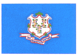 |
Connecticut: Their flag went in to effect in 1897. It has a blue background with the state shield and a banner reading "Qui Transulit Sustinent", which means "He who Transplants [Us] Sustains [Us]. Hmmm. As much as I want to like this flag, I just can't do it. The kooky Latin quote helps, but this flag is still sub-par. 4. |
 |
Georgia:
This here flag was adopted in 1956, boy! The right two-thirds of this flag is a
rebel flag, while the left third is the state seal with a blue field. Now,
there is a bit of controversy over the rebel flags' placement on this and
another southern flag (I'm not going to give away the surprise yet!). It seems
some people believe that the rebel flag doesn't belong on a state's flag due to
the racism that was prevalent in the Old South. That's a good reason. The problem is that the Civil
War was not about slavery, but states' rights. That's why they formed a
confederacy, with the states having much more power than the federal
government. Of course, confederacies are weak, due to bickering between the
states. You lost, get over it. The rebel
flag on this flag, the roof of the Duke boys' car, and at NASCAR races is about
being proud to live in the South, not to glorify racism (for the most part, but
there are some assholes). But doesn't the Ku
Klux Klan fly the rebel flag? Flags aren't racist, people are. Of course, if you
live anywhere but the South and fly a rebel flag, you suck. Going back to the
flag, putting the state seal on the flag is perfectly acceptable. In fact, it's
a very popular thing to do. Most state seals look decent, and this is no
exception. It gets a 5 because dumbass rednecks like it. |
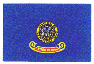 |
On to Idaho. In ought-seven they adopted the Idaho flag. Idaho's flag sports a blue background with the state seal in the center of the flag. There is also a little "State of Idaho" banner underneath the seal. I really hate this flag. It's crusty. It's got an unimaginative blue background. It says The State of Idaho on it twice. I think a big potato would look better. 2. |
 |
Illinois: Their flag first flew in 1915. It is simply a white field with the state seal in the middle and "Illinois" in blue letters under the seal. This is just an average flag. The bird scene is nice, but the colors seem washed out and it's got the state name right on the flag. Sigh. 5. (Corn!) |
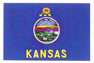 |
Kansas: If you were alive in 1927, you could go watch the Kansas flag being hoisted for the first time. It has a blue background with the state seal, "Kansas" underneath the state seal, and a sunflower over the seal. This could have been The King of the Flags, but I had to give the mandatory two-point deduction for a giant Kansas logo right across the flag. Unfortunately, an 8. (Corn!) |
 |
Kentucky: Snag a pic of the Kentucky flag being hoisted in 1918. You'll be glad you did. It has a blue field (don't they all?) with two guys shaking hands in the center. The state motto "United We Stand, Divided We Fall" encircles them, while a wreath reading "Commonwealth of Kentucky" surrounds that. Although it features an obviously cliché blue background, the motto and the two-guys-shaking-hands scene provide for a good-feeling flag. Serenity now! 7. (Lotto!) |
 |
Louisiana: Congratulate Louisiana of adopting a flag in 1912. It has a turquoise background (looks blue in this picture, though) with a pelican (!) in the center and a banner underneath it reading "Union, Justice, and Confidence". Believe it or not, the pelican is actually stabbing itself in the chest with its razor-sharp beak so the starving babies can feast on its nourishing blood. I am not making this up! That's something pelicans do when food is scarce and Mommy's blood is the only source of nutrition. I love it! Also, the motto rocks. 9.5! |
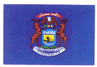 |
Michigan: Thanks to me, you know that Michigan's flag was adopted in 1911. Now get a snack, because this is going to take a while. The flag has a blue background. At the top of this mess, there is a banner reading E Pleribus Unum ("One [Nation] Made Up of Many [States]"), then on the way down there is an eagle, two deer fighting, a shield reading "Tuebor" ("I Will Defend"), two leaves, and a banner reading "Si Queris Peninsulam Ameoenam Circumspice" ("If You Seek a Pleasant Peninsula, Look Around"). This flag is a mess! There is way too much going on. This would be the best flag if it only had the mottos and the deer fight. It's simply too much. 6. |
 |
Minnesota: Hop in the Way-Back Machine and press the 1957 button so you can see dirty beatniks, segregation, and the flag adopted. It is simply a blue field with the state seal in the middle. Another ho-hum blue-background-and-state-seal design. 5. |
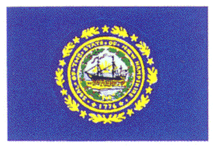 |
New Hampshire: What's 1984 minus 75? Whip out your calculator to find out the flag's adoption year (you non-Americans probably won't need one, though). It features the classic blue-field-with-white-state-seal design. I don't like this flag. There's nothing special, although the ship does look like a pirate ship. Arrr! 3. |
 |
New York: Ralph watched with baited breath as New York's flag was hoisted in 1901. Oy vey! This is complex. There's an eagle, a globe, Lady Liberty, Lady Justice, an "Excelsior" ("Ever Upward") banner and a sailing scene all depicted on a blue background. Everything looks great, save for the globe and eagle. The Lady Liberty/Lady Justice scene is nice, plus the flag has the best word in the world, Excelsior, on it. 7. |
 |
North Dakota: In 1911, the cool thing to do was see this flag adopted. A blue field, an eagle, and some stars reside in the center with a "North Dakota" banner in the bottom. Not a good flag. It's just not right. The giant eagle looks like it belongs on the Smokey and the Bandit Trans Am, and it has the state's name on the flag. 4. |
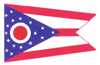 |
Ohio: On a sunny day at Broad and High Streets in 1902, Ohio got its flag. It is a double-pennant design with red and white stripes across it, and a blue triangle with 17 stars and an O on the left. I am ashamed that this flag represents our state. Ohio, did you ever think that you'd look stupid using a non-rectangular flag when everyone else's is rectangular? I realize that Alabama's flag is square, but if you managed to graduate middle school you know that squares are rectangles as well. It lacks bright color, too. 2. (Corn!) |
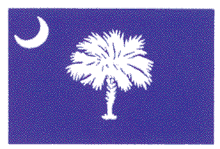 |
South Carolina: 1861. You know what happened. It has a blue field with a palmetto tree in the center and a crescent moon on the upper left. This flag is simple and to the point, and the tree looks good. But the crescent moon looks almost satanic. 5. |
 |
South Dakota took their sweet time adopting a flag, because it didn't hit until 1963. You've got a blue background with the state seal and a blazing sun in the middle. For some reason it says "The Sunshine State". I hate you, South Dakota. First of all, you're not the sunshine state. That's Florida. Recently, it appears that they have changed the text to read "The Mount Rushmore State". This fixes nothing. The fact that they had called themselves "The Sunshine State" for so many years still ruins the flag. Second, the flag is too plain. Third, they have the state name on it not once, but twice. Yuck. 1. (Corn!) |
 |
Utah: In the Year of Our Lord, Nineteen Hundred and Thirteen, they got a flag. Guess what? There's a blue background and the state seal. There is a neat little beehive, though. This is just an average flag, but I like the beehive in the center. It looks like one of those incredibly unrealistic beehives that you see fall on people's heads in cartoons. It helps the flag to a 6. |
 |
Vermont: Put on your flapper skirt and see them adopt the flag in 1923. Then go to the speakeasy. You have your, uh, timeless blue field with a nice little tree scene and a banner that reads "Vermont: Freedom and Liberty". This is just a good flag. The scene is so relaxing, and it's colorful. The deer head is neat, too. 8. |
 |
Virginia: Sunday, Sunday, SUNDAY! See Virginia's 1861-era flag! HOISTING! SPEECHES! REVELRY! You can buy the whole seat, but you'll only need the edge! A guy stepping on another guy's chest with the motto "Sic Semper Tyrannis" ("This is what always happens to tyrants") make this flag one of the best, in fact, The King of the Flags! The guy in blue has just killed the other guy, and is standing on the loser's chest. This is what America is all about! 10! |
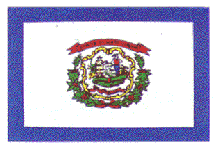 |
West Virginia: The Mountain State procured a flag in 1929. It has a blue border, white background, and the state seal in the middle. It features two hilljacks who have apparently decided to take a moonshine break. Nothing wrong with that, boys, but watch yourselves around those axes. West Virginia's flag is pretty cool. 7. |
 |
Washington D.C.: I wonder what admitted crackhead and D.C. mayor Marion Barry thinks of its 1938-era flag. It is an awful, awful flag. No color, no excitement, nothing. It gets a 1. |
And
finally, the U.S. flag. Everyone knows what it looks like. Three sevens for
good luck (does that sound like something out of Uncle Wiggly?) means it was
adopted in 1777. It has undergone many changes up until the current one adopted
in 1960. You can't critique the American flag, that'd be just wrong, dude.
So,
what's the average score for all of the flags in the review? 5.58, which means
that the states had better clean up their act as far as flag design goes. If
all flags had pelicans, fighting, pirate ships, deer, moonshine, beehives, and
Latin mottos, the U.S. could say that we have the best state flags in the
world. Right now, other countries are pointing and laughing at us for allowing
horrible flags like South Dakota's and Washington D.C.'s to fly. If you live in
a goofy flag state, write your congressmen and demand a change! Every time you
drive by a school, firehouse, or McDonald's you are reminded that you live in a
goofy flag state. If you live in a goofy flag state, and your state puts their
retarded flag on their license plates, your car is sullied! You paid all that
good money for a beautiful new Daewoo, and then your goofy flag state foists
ugly tags on you! Instead of having some dumb ornamentation on your state's
flag, you have the power to get a skull and crossbones flag hoisted. Keep in
mind, though, that all of these flags have their merit, and each little detail
means something significant. If you remember the importance of each flag, no
matter how ugly, and the dos and don'ts of handling flags, I've done my job.
You may never look at flags the same way again.