Here are the character designs that I think would combine to make the Ultimate Batman: The Animated Series. Feel free to send me your own lists of your "ultimate" lists. Batman: The Animated Series is noted as "BTAS" and The New Batman Adventures is noted as "TNBA."
TNBA BATMAN DESIGN:
 I would pick this Batman design not only because it embodies the classic look from "The Dark Knight Returns," but also because it is more streamlined, allowing Batman to be a swifter, sneakier defender of justice.
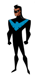
TNBA NIGHTWING DESIGN:
 Rather than choose a Robin design (I would have picked the Dick Grayson Robin), I picked my favorite incarnation of Dick Grayson, which happens to be the new Nightwing. If only they'd do something about his hair...
BTAS BATGIRL DESIGN:
 The classic Batgirl design from the original series remains a better choice than the new all navy blue and yellow costume. Not only is the costume nicer to look at, but Batgirl's character in the original series was much more interesting and likable than the new air-headed sidekick version.
BTAS ALFRED DESIGN:
 The original Alfred design is nice and dignified. He hasn't changed a whole lot, but I dislike his new thicker neck and not-as-visable chin.
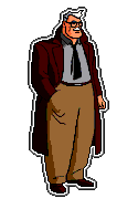
BTAS COMMISSIONER GORDON DESIGN:
 I like the original Gordon design because he looks more powerful and nicer than the new one. I think the redesign makes Gordon look old and frail, which doesn't seem right to me.
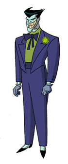
TNBA JOKER DESIGN:
 The new Joker design is better because the Joker looks sleaker and more sinister. I think the lack of red lips and the new black eyes make this Joker a much nicer design than the earlier incarnation.
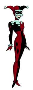
TNBA HARLEY QUINN DESIGN:
 Although she hasn't changed much at all, I prefer the new Harley Quinn design over the old because she is streamlined, and her blue-gray greasepaint matches quite nicely with Mr. J.
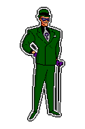
BTAS RIDDLER DESIGN:
 The old Riddler design is stylish, adding to the craftiness of my favorite villain. It shows that you don't need spandex to ask great questions. I don't like the new version very much at all because of the trip back to tight-fitting neon green apparel, but I still like him.
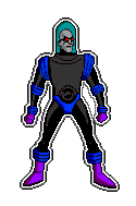
BTAS MR. FREEZE DESIGN:
 The original Mr. Freeze design is perfect for his character; a suit that was built out of necessity for his chronic state. It also humanized the character which brought "Heart of Ice" to life. I detest the new design. Freeze's head looks wrong, and the whole idea that he's ONLY a head really sucks.
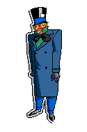
BTAS MAD HATTER DESIGN:
 The old Hatter design brings to life the story which it comes from. While this Hatter look dapper and well-to-do, the new design makes him look like rubbish and he doesn't even feel human; he's more rat-like. UGH!
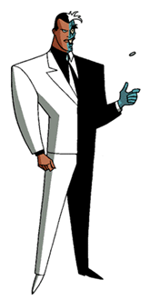
TNBA TWO-FACE DESIGN:
 The new Two-Face looks much better for the part than the old. While the basic design is the same, the streamlined effect works nicely on him.
BTAS POISON IVY DESIGN:
 I like the old Poison Ivy better than the new because she's a better representation of the character. She looks like she could be one with the earth. The new design looks icy and dead, which is what the opposite of her character should be. The original just looks better.
TNBA PENGUIN DESIGN:
 I think that the new Penguin design is much better than the old "Batman Returns" design the creators were forced to use. This Penguin is a classy figure who looks ready for a corporate take-over or an expensive social function. It's much closer to the classic representation.
BTAS CATWOMAN DESIGN:
 I prefer the old Catwoman design to the newer more feline one. I think that the original design looks more human and is much better looking than the new version.
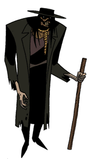
TNBA SCARECROW DESIGN:
 The new Scarecrow is much more frightening and creepy than either of the versions previously used on the show. The new, more serenely creepy voice also adds to the scare factor.
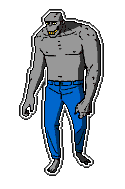
BTAS KILLER CROC DESIGN:
 I like the older Croc design because it makes the character more human. If the new design would have been used before, the episode "Sideshow" would never have worked. That's because the episode basically said that "circus freaks" are real people. The new Croc could never pass for a person.
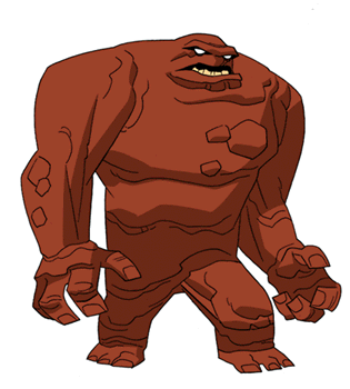
TNBA CLAYFACE DESIGN:
 The new Clayface is basically the same design, but now he is more massive and looks more clay-like. Good job, Bruce!
Back


