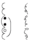
All of our font collections come in Windows'« Truetype«
format, and include Microsoft Write« documentation containing keymappings
and examples. These fonts are 'Charity-ware'. (Meaning: if you like
the fonts and plan to use them, please give a little more than
usual to your favorite charities such as the Salvation Army, United
Way, or others the next time you have a chance.)
-


- Bajoran There are two Bajoran fonts: Bajoran ancient and
modern. Bajoran modern has only 12 regular and 1 uncommon characters,
and the characters are used in any of 4 rotations. [only 2 included.]
Since Bajoran modern was so skimpy, an Ancient Bajoran font is also
included. It is based only on one sketch of one monument used in one
episode that I happened to find in the book The Making of Deep
Space Nine. Bajoran is often written up and down like chinese.
For more info about the Bajoran language visit
The Bajoran Archives, an encyclopedia with Bajoran phrase book.
view a pic of fan proposed bajoran phonetics.
I recently got some screen captures of "The Reckoning". They showed
the previous language out of which the present modern Bajoran developed. Jadzia Dax's translation
program split the older form into 2 letters for the modern form. This shows Bajoran requires
an even number of modern characters to form a word or idea.
I will try to font the older form some time in the future.
-


- Borg I have examined StarTrek: First Contact and ST:Voyager - ScorpionII
for Borg lettering, some of the newer books & Elmo of Borg sent me screen captures from the Game
ST:BORG. There is one form declared as alpha-numerics and 2 more forms that might be
writing that I can tell:
- The one form declared as alpha-numeric Borg was small circles with geometric chunks missing.
These are the ones I have fonted for a-z, A-Z, 0-9.
- The second form is similar to Binar except that the circles shade from dark to light and
vise-versa from the center, and they have no crosshairs. Some circles also have little triangles
in them to one side. I also added a variety of these [w/o triangles] to the font as punctuation.
- The third form looks like a bunch of sine waves along an axis, often seen together with
the second form. I added 2 of these to the font as well.
- [The common Borg circular screens with the electrical discharge seen above each
drone's bay have been declared as non-script.]
Thanks to Elmo Of Borg for scanning and the source material for Borg, and to everyone else
for their encouragement. Also check out the Krenim below for a similar style of writing.
-


- Cardassian There is only one Cardassian font, but with two
character styles in it because there were so few letters. Cardassian
can be written in many different ways. Letters seems to be usable as:
upside down, backwards, run together, and distorted into wide low
'fat' shapes. However, they are always the same set of letters.
This font does not include all forms/rotations of each letter, it only
includes two basic forms.
For more info visit
The Cardassian Encyclopedia Web Page, which has lots of info including language & the
Author Esther Schrager page for her Kardassi language.
-


- Dominion This font is mostly based on the Written Language section of the newest
version of The StarTrek« Encyclopedia. All characters & symbols are canon.
I saw no numbers. I have made most characters to be usable as both rightside up &
upside down, since the book showed them both ways. I thought it could also be written vertically,
but I couldn't find my source for that.
There is only one Dominion font that seems to be used by the Shapeshifters,
Jem Hadar, and Vorta. Perhaps the Tosk & Hunter/Navigators and the Kareema traders also use
it.
7-6-98
-


- Ferengi There are three Ferengi fonts: Ferengi Gothic, and
Ferengi right and left. The Ferengi alphabet has more letters than
the English, and these fonts also include 2 rotations of the letters
each. The Gothic style was only fonted in the right hand style, as it
was the only style that was used in the episodes. Ferengi has a
peculiar written paragraph format.
-


- Tim Miller Ferengi. This font is the beta version thus far.
It is designed to be semi-canon so as to fit with Timothy Miller's
designed Ferengi language. It is 98% complete but is unlikely to get much
further soon, as Tim has moved on to other things. (We have to figure out the numbers
and punctuation yet, if any.)
Universal Survey of Languages: Ferengi
has Tim Miller's feregni language.
-


- Klingon« Qo'nos by Mike H. Lee & Josh Dixon. This is in the more modern style,
Klingon (Qo'noS) font comes from the Star Trek Encyclopedia, the Next Generation & the
Trek Movie The Undiscoved Country. The letters "A" thru "R" and "Z" are canon.
Klingon (Qo'noS) goes left to right. On the percent key this font also has a Klingon
ceremonial banner in it.
Michael Lee 9-7-98
-


- Klingon« Hollow by Tommy. There are two Klingon TOS fonts: Klinzhai and
Klinzhai Hollow. The Klinzhai font was originally created years ago
by Dr. Lawrence M. Schoen, and is based on the Klingon« alphabet used
in the original StarTrek« series. I have added to the original
by creating a hollow or outline version of the font. If you want Klinzhai itself, or
if you have & use it, please visit the KLI & pay a shareware fee for their fonts.
Support the KLI!
Today, Dr. Schoen is the Director of the non-profit organization:
the
Klingon Language Institute (KLI). Dr. Schoen explains that the
alphabet represented by the Klinzhai font can not be used for
actually writing the Klingon language, and it is not pIqaD. It simply a collection of
Klingon-looking symbols that were used to resemble Klingon writing. BUT the KLI has
organized their pIquaD font to mesh with the accepted Klingon language sounds. People
interested in learning the Klingon language and the accepted writing
system to go along with pIqaD font, should contact the KLI for study materials
and fonts:
For another SHAREWARE version of pIqaD visit a
multilingual page by a Finn, it has his
version hidden there - it may take some hunting.
-


- Rihannsu Romulan, by Mike H. Lee, Josh Dixon & Tommy. This font uses the same Romulan«
script seen on the shows & movies, the new encyclopedia was used as a major source. It is
completely canon. There is another Romulan« font out there, but we feel this one is better.
To avoid confusion we have named this one Rihannsu, in honor of Diane Duane's books.
Romulan« is usually written up & down. The % key is the Romulan« warbird symbol.
9-1-98
-


- Trill. This font is based on the Written Language section of the newest
version of The StarTrek(tm) Encyclopedia. "c"-"k" are canon, "A"-"Z" are
inverted colors. The rest ["l-z", "L-Z"] are just rotations of canon letters to
fill out the font keyboard. I saw no numbers.
Trill seems to be written vertically, although it could also be used horizontally.
1-04-98. Due for update soon! I have some new source material
from Ezri Dax's visit home.
-


- Beta Release: Old Vulcan. Here is a Beta Release of
Old Vulcan. It is very very difficult to font well and I am not satisfied at all with the result
of the script so far. However, I am sick of working on it, so at the request of several fans,
I am giving you this Beta. It may never be finished any further by me, or it might.
Other fans may try to font it and may do a better job. The more power to them!
This Beta contains both the Calligraphy version and the Lineal version of the symbols. These
symbols each seem to represent a complete phrase or sentence, not a letter nor a word.
Meanwhile take a look at
Marketa Zvelebil's home page, creator of the Vulcan language.
Here is Quozl's [a fan] view: it's a cursive script (like Arabic), written vertically, in
columns left-to-right, like Mongolian. The _big_ difference is that it's a syllabary
(ref: "Unification", Pts. ! & 2), rather than an alphabet; in other words, each
character in the string is a syllable.... :)
Elmo Of Borg is working on a translation system to Vulcan Grammar. Good Luck!
-


- Modern Vulcan v1.1 . This font is based on a GIF Josh Dixon sent me, the symbols of which
showed up on a DS9 shipping case from Vulcan, & in such cannisters seen in movie ST IV. In
that movie, & in TNG episode "Unification" part 1&2, Vulcan can be seen to written
vertically - up/down. Also in the semi-canon novel Spock's World it is mentioned
that T'Pau wrote downward. I do not know if the symbols mean letters/sounds, words, sentences
like old Vulcan or something else. Thanks for the info Josh Dixon! His source GIF is included.
1-03-98.
Updated 1-08-98
This page Top
-


- Andorian by Mike H. Lee & Mike Dolan. This non-canon font is based on the Last Unicorn Games
Star Trek RPG Sourcebook "Among the Clans: The Andorians". This is listed as part of their
"Alien Intelligence" series of sourcebooks. Their Andorian spoken language itself is called Graalen, and
the written version is Graalek. For further info on this constructed non-canon language, buy the book!
This is the only Andorian font I know of, so here it is. There are other fan created and equally valid
Andorian languages that can be linked through my link page. However
these do not have any script that I know of. 6-24-2000
(Btw: I do know Andorians have been glimpsed in other series, but I think it belongs here in TOS section.)
-


- Fabrini by Mike H. Lee & Josh Dixon. This font is based on the original StarTrek«
episode For The World Is Hollow and I Have Touched the Sky in which the Fabrini's
writing was seen inside their asteriod ship on the walls, on an obelisk and in a book.
The font is canon "A" thru "Z" and "1" thru "3", Mike made up the rest.
note: Fabrini seems to be ideographic, that is: each symbol represents a
word; and Fabrini seems to be written both left to right, like i do here,
and in triangluar form, as in the GIF above:
Source Gif included of the triangular writing.
7-20-97.
10-30-97 Updated.
-


- Preserver by Mike H. Lee & Josh Dixon. This font is based on the original StarTrek«
episode The Paradise Syndrome in which the Preserver writing is to be found on an obelisk
(An asteroid deflector) on the planet, left by the Preservers centuries ago. [The Preservers
are an unknown race that moved American Indians to another planet.]
The font is all canon. It was claimed in the show that the symbols are not words but musical
notes, tones that correspond to an alphabet. The language's direction of writing is
uncertain, but probably left to right. Source Gif included.
8-7-97.
10-30-97 Updated.
This page Top
-


- Binar. This font is based on the Next Generation« episode in which
the Binar's writing was seen. Thanks to Joseph M. Osborne for scanning and
the source material for Binar.
-


- El Aurian: I have used as the source some El Aurian [Guinan's people] lettering
on Dr. Soran's rocket controls in the movie StarTrek: Generations«. El Aurian seems to
have two types of writing - one looks a bit like scribbles, the second like it has been turned
into geometric non-flowing printing for computers. I put both into one font - minors (a-n) for
the scribble, and capitals (A-Y) for the geometric. The El Aurian number system seems
to be quintal [0 to 4]. For example: 10 quint = 5 decimal, 133 quint = 73 decimal. [I think]
El Aurians seem to prefer downward writing of lettering and numbers, not left to right. However,
for technical reasons I had to fit the characters in sideways. When you print it out or put it
into a graphic, make sure you rotate it a 1/4 turn.
-


- Iconian by Mike H. Lee. This Iconian font comes from 1989
Star Trek: The Next Generation« episode Contagion
and the Deep Space Nine« episode To the Death.
The Canon letters are (A,B,C,D,E,F,G,H,I,J,N,O) and the Canon
numbers are (1 thru 5). These canon letters and numbers are the
best that I could pick out. The percent key has the Iconian
symbol in it.The rest of the font was invented by Mike. Iconian is written
both horizontally & vertically, your choice.
Michael Lee 2-17-99
-


- Malcorian by Mike H. Lee & Josh Dixon. This Malcorian font comes
from the 1989 Star Trek Next Generation« episode First Contact.
All of the font is canon. The Malcorians seem to write left to right as well as
up and down.
3-16-98
-


- Bak'u by Mike H. Lee. This Ba'ku font comes from a Bak'u children's book seen
in the 1999 movie StarTrek: Insurrection«. All the letters are canon.
See also the related Son'a. They were once the same Alien race.
Ba'ku is shown written vertically down.
Michael Lee 2-15-99
-


- Son'a by Mike H. Lee. This Son'a font comes
from the 1999 movie StarTrek: Insurrection«. All of the font is canon.
See also the related Bak'u. They were once the same Alien race.
Son'a is shown written horizontally.
1-22-99
Updated 2-11-00: new symbol in the "period"
-


- Sheliak by Mike H. Lee. This Sheliak font comes
from 1989 Star Trek:The Next Generation« episode Ensigns of Command. The Canon
letters are (A thru T), the rest of the font was invented by Mike.
The source info comes from Tommy. Sheliak is written left to right.
4-2-99
-


- Tkon by Mike H. Lee. This Tkon font comes
from 1987 first season Star Trek:The Next Generation« episode The Last Outpost.
The Canon letters are (A thru Z) and the Canon numbers are (0 thru 2). These canon letters
and numbers are the best that Mike could pick out. The percent key has the Tkon symbol
in it.The rest of the font was invented by Mike. The source info comes from Tommy.
Tkon is a complex language we can not get completely right with present font technology,
because the Tkon letters for a word seem to be written on top of each other. To write Tkon
correctly you need something like the animated GIF above. The words themselves seem to
seem to be written from left to right.
5-7-99
This page Top
-


- StarTrek« NyrianThis font is based on the episode "Displaced" of
StarTrek: Voyager« in which the "hijacker" Nyrian lettering is shown on
their computer screens. Nyrian seems to be written up/down, with only 15 basic shapes
that were rotated and flipped to give 58 characters on the Nyrian computer screens.
I used "A-Z, a-z" and "1-6" to fit all the characters.
7-3-99
-


- Kazon, fonted by Paul Michael Basehore. This entire font is canon, except the
number 4 [which was invented], and Paul's source is the ST:Encyclopedia.
The dots and dashes seen in the source pic are now the numbers and the
punctuation, respectively, in the font.
2-24-01
-


- Krenim. John Daniel sent me a great source GIF for this font used
in a series of StarTrek Voyager« episodes. These time-manipulating aliens seem to write
in a left to right manner very like the Borg! The Borg use circles, the Krenim ellipses.
Like the Borg, the Krenim link things with wavy lines, but also have various circles & lines
going vertical. Perhaps there is some ancient link between the two, or perhaps this script
similarity is because they both have to represent something about time manipulation?
10-1-98
-


- Vidiian, by Mike H. Lee, Josh Dixon & Tommy. This font uses the same Vidiian
script seen on the Voyager« episodes, all of the font come from the Star Trek Encyclopedia
and is canon except for the following letters: J,K,N,P,Q,R - these letters are made up to
fill the font, but follow the Vidiian style. Vidiian is usually written left-right, with
occasional lines connecting legs for some unknown grammatical reason. Some characters
can overlap others, so you can "create" new characters.
The lines connecting the legs were especially hard to get right, a variety of lengths are
included in the font for you to experiment with.
9-1-98
-


- Voth ,This font is based on the episode of
StarTrek Voyager« "Distant Origins" in which the advanced dinosauriod Voth lettering
is shown on the screens. It is ususually written downward in columns, left to right.
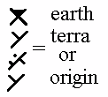
The GIF above shows the lettering used when earth pic was on the console, so I assumed
it meant either Earth [dirt], Terra, Origin planet, or Home.
1-18-98
updated 2-17-98 with captials duplicated from minors, some spacing changes.
 NOT YET AVAILABLE: Taresian. This font is based on the episode of
StarTrek Voyager« "Favorite Son" in which the "black widow" Taresian lettering
is shown on the walls. It may be done next summer. Note this sample pic is very crude,
I should have made it more curvy.
Other projects : other fonts I, Tommy, have been asked to do, but have not gotten
source code for yet [or time] are from the New ST Encyclopedia. Feel free to request more, or to emphasise
which you prefer I work on next. Priority goes to people who send video captures or scanned
source material!
Other Languages: in the new ST Encyclopedia there are sections [Consoles, Signage,
Symbols & Written Languages] that show samples of trek languages. Some I have not seen before are
Iconian, and a lot more minor one show races, as well as the Major
Races that have already been fonted here and elsewhere. I plan to do some of these,
because some fans made requests!.
My local TV station dropped StarTrek Voyager«, so I have not been able to capture anything from the
last few seasons. Those of you who want one of the later seen aliens languages fonted need to
e-mail screen captures to us.
If you still can't find the Alien, Fantasy, Human or StarTrek« -
inspired Windows« TrueType« font that you're looking for, you may
want to visit some of the font web site(s) on my Other page's
Font Links section!
If you would like more information about fan developed StarTrek«
languages, about trek alien races or about other aliens, then you should visit the great web pages
on my trek, B5, &
general SF sections of
Tommy's recommended link list!
This page Top
CONTACTS
This page hosted by
 Get your own
Free Home Page

 Attention Mac Users!
Here you can get a utility, called TTConverter, to convert PC Windows True Type Fonts
into a Mac usable Post Script I format. TTConverter is compressed into SIT format, so you
will need STUFFIT to decompress the program. For more information on how it is used, go to
Mary Forrest's Page.


![]() NOT YET AVAILABLE: Taresian. This font is based on the episode of
StarTrek Voyager« "Favorite Son" in which the "black widow" Taresian lettering
is shown on the walls. It may be done next summer. Note this sample pic is very crude,
I should have made it more curvy.
NOT YET AVAILABLE: Taresian. This font is based on the episode of
StarTrek Voyager« "Favorite Son" in which the "black widow" Taresian lettering
is shown on the walls. It may be done next summer. Note this sample pic is very crude,
I should have made it more curvy.