Creating Backgrounds
An HTML background is simply an image that is repeatedly displayed in the browser
window "behind" the text and foreground images. You load a background image using the
<BODY> tag. For example, to load a background image named SLATE.GIF,
you'd enter this:
<BODY BACKGROUND="SLATE.GIF">
Convert to Seamless Pattern Method
One of the easiest ways to create a background image using Paint Shop Pro is to
make a selection and then use Selections | Convert to Seamless Pattern
after painting an empty new image with a single color using one of PSP's paper textures.
Here's an example:
- With a tannish-yellow as the background and a brownish color as the foreground, open a new
200x200 image.
- Pick the airbrush tool, with a large brush and woodgrain paper.
- Paint the entire image. Don't be too heavyhanded with your painting here
and don't be too concerned if the painting is a bit uneven
(although the more even now the less you might need to fuss with it later).
- Adjust the color with Colors | CoLamanderze, if you like.
- Pick the selection tool, then select an area of your woodgrained image. Select an
area that you find pleasing and that is not too close to the edge of your image.
- Choose Selections | Convert to Seamless Pattern.
If Convert to Seamless Pattern is grayed out, check to see if you have made a selection.
If Convert to Seamless Pattern is available but you get an error message that
the selection is too close to the image's edge,
then go back and try selecting an area that is further from the edges.
- Save the resulting image as either a JPEG or a GIF. In fact, try it both ways
and see which one is better. (JPEGs are smaller but, because they're "lossy", they
sometimes show distracting edge effects when used as background images.)
Although this method is easy, it often gives less than acceptable results all by itself.
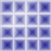
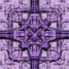
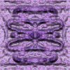
Here are a few images I created with PSP's paper textures and Convert to Seamless Pattern:
Click on each of these images to see how it would look as an HTML background.
With a little adjusting, some of these might be tweaked into acceptability.
And with a lot of fiddling, all of them could be made into nice backgrounds. For example,
by adjusting the contrast and brightness of the blue grid image above, I got this:

Click on this image to see how it looks as a background.
For images that have fuzzy edges or "noisy" patterns, this method actually works quite well.
In fact, the concrete-like pattern in the backgrounds I use on this site was made this way.
Here's something like what I did for the overall concrete pattern that I use on my PSP4
tutorial pages:
- Open a 200x200 image with a white background.
- Select Image | Noise | Add.
- Select Random and increase the amount of noise until you've got something you like.
- Select Colors | Greyscale to change all the colors to shades of gray.
- If you think the brightness or contrast needs adjusting, use Colors | Adjust |
Brightness/Contrast.
- Follow the directions given above for using Convert to Seamless Pattern.
Before we leave this topic, here's an example
of a rather successful application of this method applied to a photograph.
And here is an example of the method used on a texture created
with filters.
Handmade Seamless Patterns
On pages 250-254 of their book Creating Web Graphics With Paint Shop Pro, Andy Shafran
and Dick Oliver describe how to make seamless patterns from just about any image. It takes quite a bit of
care and time, but the results can be quite nice.
Here's one example of a background I made using this method.
And you can also take a look at Handmade Brick Background
in the How-to section for another example, along with instructions.
Quickly, here's the idea of how to use this technique:
Open the image from which you want to create the tile. Crop it if
necessary to get the basic tile that you want.
You then refine the edges in a few not-so-easy steps:
- Select All and then copy the selection to the clipboard.
- Increase the canvas size to twice the height and twice the width of the original image.
(Select Image | Canvas Size and then set the height and width appropriately.)
- Paste the selection from the clipboard below the original image, being careful to match
the edges as closely as possible.
- Use the Retouch tool (or, if you're really compulsive, the Paintbrush or Clone brush) to
"blend" the edges together. Be sure to note the vertical position where the two copies of
the image meet, too, so that you can crop out the extra copy later on.
- Paste the selection from the clipboard to the right of the original image, then
blend the edges of the right copy and the original as you did in the last step with the bottom
copy and the original. Be sure to note the horizontal position where the original and
the right copy meet, so that you can crop out the extra copy.
- Now the really hard part: Select the blended right edge (from several pixels to the left
of the edge to the very edge itself) and copy this selection to the clipboard. Then paste
that copy as a new selection and place it on the left edge of the original image area,
being careful to position the selection exactly. Do the same thing with the bottom edge,
starting your selection a few pixels up from the edge and going to the exact bottom edge.
Copy that selection to the clipboard, then paste the copy as a new selection and place
it exactly over the top edge of the original image.
- Select the area of the original image, using the vertical and horizontal positions
you noted earlier as guides. Use Image | Crop to Selection to crop away the extra copies that
you pasted in in the previous steps.
With any luck, you'll now have a nicely tiling seamless pattern.
The Easy Way
The easiest and most effective way to make a seamless background tile is to use a
plug-in filter specifically designed for this purpose, such as some of
Sandy Blair's Simple Filters.
Below are some examples of tiles I made using these filters, following the result in each
case with a hot wax coating (Image | Other | Hot Wax Coating):
 |
 |
 |
 |
|
Image at upper left is the original.
|
You can click on any of these tiles (even the original) to see how they would look on a page.
You might also want to take a look at the second part of the Filters
section for a brief discussion of plug-in filters.
|


