Tutorial 5
The image for this tutorial is at the bottom of the page.
Working with Layers: Ok we are going to start picking up the pace a
little bit. You have the basic skills of adding drop shadows, using some of the
tools.. the rest will come with playing. Today I am going to add one more
tool.. the freehand selection tool. And we are going to work with a layer to
make a patterned background, freehand. This can be done with seamless tiles..
but personally I like having the freedom and the little imperfections make it
more personal. This is my feeling, if you don't like the look, at least you are
learning to work with layers which you need to do before next weeks tutorial.
I have included an image to use for this project but if you want to select one
yourself.. you will need to find one that has a little flower, or bird, some
little object that catches your eye in the details of your graphic.
Using the original graphic, frame it using last weeks tutorial or not... it's
up to you. I am choosing to frame mine. Don't forget to resize your image so
that it is a workable size.
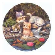
In this kitten image one of the things that really grabs my attention is the
water lily flowers. I am going to use this in my background.
First you need to open up your background image... 975 by whatever size your
graphic is plus 25 more pixels.. this give you room to play. Pick a color to
set off your graphic. With this on top... your active window.. right click on
the layer control.. and add a new layer. When the box opens up for the layer
information you can just click OK.. there  are no changes that you need to
make.
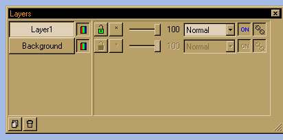
You will see that there are two layers in the box
now.. your background and your layer 1.
Now going back to the original image... select the freehand selection tool: it
looks like a lasso. In the controls palette you will see: Selection Type:
Freehand
For Feather: make the number 3.
Make sure Antialias and Sample Merged are not checked.
Holding your left mouse button down draw a freehand shape around the image that
you have selected to put in your background... get as close to the image edges
as you can.. feathering will increase the size a bit and give you fuzzy edges.
After you have it selected to your satisfaction, copy it... go to the
background image, and with layer 1 selected. (See the above image to see how it
should look.) Now trying to keep the images fairly evenly spaced paste them in
a V shape.. (see the background of the stationery this is sent on for an idea
of placement... make sure you go all the way across.
Ok this is why you used a layer to do this... you will see the the little image
is - first a different color than your background, and it's dark. When you try
to write a letter over these images you might have to change font color over
these images for the words to show...not fun, doesn't look good. So.. the
middle column of the layer control you will see that next to Layer 1 you can
move that slide.. as is it's at 100% opacity. Moving this slide to the left you
can lighten up those images, I set mine at 60% opacity. After you get it how
you want it.. right click on the Layer Control and Select merge all.
 Right Click on image use Save As
to save save image
Tutorials | Tutorial 1 | Tutorial 2
| Tutorial 3 | Tutorial
4| Email Me|