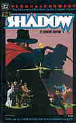
 Written
and illustrated by Howard Chaykin.
Colour: Alex Wald. Letters: Ken Bruzenak. Editor: Andrew Helfer.
The
Shadow: Blood & Judgment 1987
(SC TPB) 112 pages
 Written
and illustrated by Howard Chaykin.
Colour: Alex Wald. Letters: Ken Bruzenak. Editor: Andrew Helfer.
Reprinting: the four issue 1986 Shadow mini-series
Additional notes: contains an interview with Chaykin.
Rating: * (out of 5)
Number of readings: 1
Recommended for mature readers.
Published by DC Comics
Howard Chaykin's version of the Shadow was hyped heavily
for its violence and luridness. When the mini-series was first published,
writer and critic Harlan Ellison, a bit of a literary bad boy (not unlike
Chaykin), and Shadow fan, had denounced it. Other reviews, though, praised
the series. Some commentaries suggested Chaykin couldn't care less about
the character...others that this was kind of a pet project for him. Personally
I knew Chaykin could run hot, cold, and inbetween.
So I was prepared for having any reaction...except the
one I did: boredom.
The Shadow had been a hugely popular character in the
middle of the 20th Century, though suffered from a split personality. The
radio Shadow could turn invisible and his main companion was Margo Lane,
while the pulp magazine Shadow dressed in a black cloak and did not necessarily
have supernatural powers; he was more enigmatic than the radio one, operating
a team of agents while lurking in the background. Under pressure, the pulp
magazine became a little more like the radio -- Margo became the Shadow's
chief sidekick, and the Shadow was more front and centre in his alter ego
of Lamont Cranston (though Craston was but one of many aliases). The entertaining
1994 movie tried striking a balance, mixing the two mythos into one.
Another version was a short lived DC Comics series in
the 1970s. Modelled after the early pulp version, with the Shadow an enigma,
it provided its own twist on previous versions by giving a more hard-boiled
spin to some of the characters.
Chaykin's mini-series is set in then-modern times. The
Shadow has long since disappeared and the Shadow's former agents are being
murdered in various novel, and grisly, ways. This brings the Shadow back
-- miraculously not having aged in 35 yeears -- to hunt the culprit, picking
up a few new agents, and reuniting with the few surviving older ones, namely
Harry Vincent and Margo.
There are two aspects to Chaykin's story; the shock aspect
of brutal violence and lurid sex (or, at least, innuendo) applied to this
old time hero (not that the Shadow, particularly in radio, didn't have
its share of violence, though no sex) and the story itself. Let's start
with the story.
The first chapter begins with the Shadow's retired agents
being murdered, and he's got a lot of 'em, so Chaykin treats us to sequence
after sequence of characters being killed in brutal -- and frequently implausibly
silly -- ways (skewered to a ceiling, stuffed in a water cooler!). We're
also introduced to the villain, and the Shadow returns, but it's an awfully
repetitious, thinly-plotted 28 pages. Things don't improve much latter.
The second chapter presents Chaykin's take on the Shadow's origin -- involving
the stock cliche of a hidden Himalayan city (though hi-tech rather than
mystical). It's a generic idea handled, well, generically. In the remaining
two chapters, as the Shadow tracks down his foe, the plotting is, at best,
simplistic, at worse, silly.
The thing about Blood and Judgment is not so much that
it's stupid, as much as that it wears its stupidness proudly, like a crown.
Chaykin often tackles his material with tongue-in-cheek, which can serve
as a counterpoint to his more serious political themes. But this is flippant,
but rarely funny. Chaykin sacrifices plausibility, or dramatic emotion,
without substituting anything like wit or comedy. And without any overt
political undercurrent -- TPB cover illustration notwithstanding, there
are no Klansman in the story -- the series emerges as hollow and soulless.
It's empty eye-candy...without any sugar.
Chaykin's art seems surprisingly ill-suited to the character.
Though he did nice with the period milieau of Batman:
Dark Allegiances, here, by transposing a 1930s hero to the 1980s, he
seems at a loss to find a suitable visual look. Put another way, wouldn't
you think that in a series about The Shadow there should be a few, I dunno,
shadows? Instead of dark and mysterious, the book is cheerily coloured.
As well, Chaykin's panel arrangements are confusing at times, as is his
whole approach to dialogue. The opening scene is cleverly done, as you
read the first page not really sure why people are saying what they're
saying, but it all becomes clear by the end of the scene. It's Chaykin
at his cheeky best. But other scenes are just needlessly oblique, comprised
of unfinished sentences and interrupted conversations.
And letterer Ken Bruzenak's depiction of the Shadow's
trademark laugh looks more like a design pattern than words.
Which brings us to the "controversial" aspect of the story
(not a by-product of the series, but clearly what DC was marketing) which
is married to Chaykin's tongue-in-cheek. The violence and kinkiness (though
no nudity) is so over-the-top, so unrelenting at times, it's hard to be
offended by it because you can't take it seriously. Chaykin is like a little
kid trying to get a reaction by swearing -- the very obviousness of his
intent is what nullifies it. Chaykin's lean, restrained art means that
the violence is less gory in execution than in concept, and the sex is
alluded to rather than portrayed. But, nonetheless, the series is full
of both, with the villains -- an aging megalomaniac, his nubile sex kitten
wife, and his genetically bred son -- such demented perverts that the series
seems like a precurssor to the Austin Powers movies' parody of super-villains.
The problem with Chaykin is that, for such a talented
guy, he can also be a one trick pony. This isn't Chaykin doing the Shadow...this
is the Shadow reinvented as a Howard Chaykin property. This Shadow bears
very little resemblance to either the enigmatic man of mystery of the pulps,
or the stand up hero of radio. He's more of a cynical libertine -- who,
in his origins, starts out as a freelance pilot in politically suspect
climes (rather like Chaykin's later series, American Century) and gone
is the Shadow's distinctive proboscis, to be replaced by a guy who looks
like Chaykin's usual heroic archetype (ala Reuben Flagg of American
Flagg) only with a slight hook to his nose. Chaykin's Shadow owes his
origin to Shambala, a mysterious hidden kingdom that can be likened to
Shangri-La out of the classic novel (and movie) Lost Horizon, except given
Chaykin's cynical, hard-boiled spin, where the Shadow characterizes Shambala's
lady leader as a "hard, insensitive witch."
There is a coldness to the story, where no one, not even
the Shadow and his agents, emerges as particularly likeable or, worse,
even interesting. Despite the Shadow having returned because of the murder
of his old agents, he never seems to regard their deaths as anything more
emotionally charged than as pieces of an abstract puzzle. Like some other
writers, Chaykin also imagines the Shadow as a death-dealing vigilante
-- but I'm not sure that was the originaal character. Certainly in radio
he never even carried a gun, while in the pulps the Shadow was armed and
wasn't adverse to getting into a shoot out, but there wasn't much sense
(in the half dozen book I've read) that he was a kill-'em-all-and-let-God-sort-'em-out
type. Maybe Chaykin confused him with another pulp hero, The
Spider.
The series was labelled as being for "mature readers"
which is, often, a bit of a misnomer. Yes, it ain't for kids in its sex
and violence...but it's hardly sophisticated and complex enough to be labelled
as mature. In one scene a woman is raped (so we infer) and in the next
scene is trading flippant retorts with the Shadow. It's a light-weight
cartoon for the post-pubescent crowd.
Clearly Blood and Judgement was designed to win new fans
by shocking old ones -- in fact, the follow up series DC produced (written
by Chaykin's editor, Andy Helfer) was eventually cancelled after the owners
of the Shadow property objected (DC, then, followed it up with The Shadow
Strikes series, which was more respectful of the original). But beyond
the "shock" value, there's little here. The plot is extremely thin, the
ideas stale, the characters barely defined. There's no underlining heart
or emotion -- or logic -- while it isn't funny enough to succeed as just
an outrageous exercise in excess.
If there's anything worse than a talent like Chaykin off
his game, it's when you suspect he's not even trying. Still, this isn't
the only Shadow graphic novel and TPB...so maybe there are better ones
out there.
The most interesting thing in the original mini-series
were essays by DC staffer (and Shadow fan) Anthony Tollin examining the
history of the Shadow in print and radio -- though I don't know whether
they have been included in the TPB (which has an interview with Chaykin).
This is a review based on the story as it originally
appeared in the mini-series.
Cover price: $__ CDN./$10.35 (?) USA
The Shadow: Hitler's Astrologer 1988 (HC & SC GN) 64 pages
sometimes erroneously identified as "The Shadow: 1941", because that looks to be the title on the cover
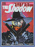 Written by Denny O'Neil and Michael Kaluta. Pencils by Michael Kaluta. Inks by Russ Heath.
Colours: various. Letters: Phil Felix. Editor: Larry Hama.
Rating: * * (out of 5)
Number of readings: 1
Mildy suggested for Mature Readers
Published by Marvel Comics.
Decades ago, The Shadow was one of the most popular characters in fiction. But he's long since slipped into semi-obscurity (people can probably still recognize the catch phrase "the Shadow knows"...but might not be able to tell you where it's from). Even the nature of the character is elusive, as he owes his fame to both a hit radio series and a best selling pulp magazine...two different takes on the character. The third medium he entered was comics, where a succession of companies have published various short-lived runs over the last 50 or 60 years.
Marvel's one and -- I believe -- only stab at the character was this graphic novel, done at a time when Marvel was playing with the graphic novel format. And though this is a Marvel publication, it reunites Denny O'Neil and Mike Kaluta -- who were responsible for some well regarded Shadow comics published by DC Comics in the 1970s!
The story is set in 1941 and has the enigmatic, dark cloaked crime fighter, The Shadow, along with his team of operatives, becoming involved in a Nazi plan too -- well, that's the weird thing. The story is mainly about Nazis double crossing other Nazis, while the Shadow hopes to manipulate things to his (and, of course, the Allies) advantage.
And the result is unsatisfying and maybe a tad ill-conceived.
Like with many-a-pop character, a lot of later creators have claimed their version is the most faithful to the original concept -- but, as I mentioned, it's hard to even decide what the original concept was, since both the radio and print versions of the character can boast equal claims to "creating" the character. Indeed, the radio version (in which the Shadow could turn invisible) is probably the one most responsible for the character's mainstream fame, yet that version is the one usually ignored in the comics. But the point is, it may be that the very concept that O'Neil (and others) have settled on for the Shadow has, itself, resulted in his comic books being commercially uneven.
Portrayed as a mysterious, enigmatic figure -- one who often seems to be privy to information the reader isn't -- he's kind of problematic as your lead protagonist. Yet often his operatives, like Margo Lane and Harry Vincent, still come across as sidekicks, rather than being well enough portrayed to act as the true heroes. The result can be stories -- in the comics -- lacking that crucial emotional/human factor of heroes we care about. Which means it's more the plot that is expected to carry us along.
And the plot here seems just kind of awkwardly developed.
Often when modern stories are written using old time characters, the temptation is to draw upon historical realities in a way the original stories never did (how many Sherlock Holmes pastiches, for instance, involve Holmes meeting up with real life Victorian personalities?). So in Hitler's Astrologer, the story is rooted in its 1941 World War II era (prior to the U.S. entering the war), involving real life Nazi Party figures, in a way real 1940s Shadows stories probably weren't. But the problem can be when the cart starts diving the horse, and there's a feeling the desire to work in historical figures, or historical events, is dictating the plot, rather than vice versa.
Here, the story hinges on the Nazis' ill-fated decision to go to war with Russia, a decision that will rest on the advice Hitler receives from his astrologer; advice that various figures want to manipulate. But too much of the rest of the story feels as though it's just padding around that basic conceit, so that we get a story where characters' actions don't really seem to make a lot of sense, or seem entirely justified -- the Shadow rescuing a woman from the Nazis...only to ask her to allow herself to be captured by the Nazis; a German who wants to intimidate the astrologer into rendering a particular horoscope...when the astrologer claims that that was the horoscope he was going to do anyway! Sure, it's not like these plot points are completely nonsensical in the context...but it does make a lot of the story just seem pointless.
And O'Neil and Kaluta seem to run into pacing problems one would expect from far less experienced practitioners of the comics art, as we get chunks of exposition, trying to cram in explanations that really needed to be worked more delicately into the narrative. The result can be scenes that seem almost like parodies of pulp thrillers, as we are treated to "surprise" revelations when we barely knew there was a question.
On the plus side is the art. Kaluta is a well regarded artist, with only a limited amount of comics work over the years, and his return to what many view as his signature character, but now on over-sized, heavy paper with rich, multi-tone colouring, was no doubt intended as a fan dream come true (not unlike my reaction to John Buscema's Silver Surfer graphic novel Judgement Day). In fact, some years before this, there were ads for a Shadow graphic novel Kaluta was supposed to draw...that never happened (scripter Harlan Ellison, apparently, never turned in a script). Making this even more of a fan dream. And the art is good, with a nice period feel and detail. And, I'd argue, Kaluta's sometimes sketchy pencils benefit from being given a surer, more polished finish by the inks of old pro Russ Heath (himself no stranger to war time comics).
But ultimately, the story just seems a bit ill-thought through. The overall plot actually seems kind of thin, the development of the personalities uninvolving (we almost seem to spend more time with the Nazis than the heroes) and the very historical minutia -- as basically the writers try to explain real life historical events by suggesting the Shadow was secretly manipulating things -- more a hinderance than a help to the story (particularly if you're not a history buff, so the revelations will have little resonance).
And, ironically, I think O'Neil shows his own misgrasp of history when he refers to a German-born, Nazi Party member giving seminars in "the United States and Canada". Although the U.S. was neutral, Canada was at war with Germany, so it seems unlikely she'd be allowed to tour Canada.
Original soft cover price: $13.25 CDN./ $10.95 USA
Sherlock Holmes
see Scarlet in Gaslight
The
Spider: Scavengers of the Slaughtered Sacrifices2002
(HC & SC GN) 96 pages
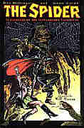 Written
by Don McGregor. Illustrated by Gene Colan.
Black & White. Letters/editor: Rich Harvey.
Additional notes: intro by editor Rich Harvey; afterward about the Spider by pulp historian Will Murray.
Rating: * * * (out of 5)
Number of readings: 1
Suggested for Mature Readers
Published by Vanguard Productions
In the pulp magazine era (the 1930s and 1940s), The Spider
probably trailed behind only the Shadow and
Doc Savage in popularity. Though he made it to the movie house (two serials)
and his stories have been re-issued in paperbacks over the years, he's
probably fallen into greater obscurity than have either of those other
characters (not that their fame hasn't waned over the years). The Spider
was clearly modelled after the Shadow -- wearing a flobby hat and cloak
and carrying guns -- but the Spider was a nastier, more violent version
of the Shadow. He wasn't just prepared to kill...his purpose was to execute
criminals, and his foes were a particularly vile and sadistic breed, often
killing hundreds per story, or with such appropriate names as Judge Torture.
Though perhaps what made the Spider also noteworthy was the added emotional
level. While Doc Savage stories were often tongue-in-cheek, and the Shadow
cool and clinical, Spider stories had the hero, Richard Wentworth, full
of teeth gnashing angst. There was also a big emphasis on his relationship
with girlfriend (and fellow crimefighter) Nita.
The Spider has had brief forays into comics (Eclipse published
a couple of mini-series in the early 1990s) and here he gets another shot
at sequential art stardom.
This time the character gets updated -- apparently not
something writer Don McGregor had intended, but at the behest of the owner
of the Spider property, Argosy Communications. Given that editorial dictate,
McGregor runs with it. Someone is going around murdering people in ways
that mimick current hit TV shows (obvious homages to "Xena: Warrior Princess"
and "The X-Files") leading a reactionary senator to campaign in favour
of censorship, his primary target: "Tiffany the Werewolf Whacker" (a.k.a.
"Buffy the Vampire Slayer"). The story hits the ground running with the
Spider sneaking onto grounds where a party in the senator's honour is being held, the Spider fearing the senator has been targetted by the killer. The Spider who, as
Wentworth, is a magazine publisher and despises the senator's censorship views, still
doesn't want to see him killed. Before long he's tussling with a bizarre
killer, a genetically created monstrosity.
McGregor, a writer frequently given to purple prose and
indulging in brooding characters and using his stories as springboards
to ruminate on life, has a field day with this. The pulp Spider was full
of brooding angst, and McGregor plays that up (while adding his own touch
of wit and humour here and there), but this time directing it at genuine
social issues (censorship, free speech, drugs, incest, corruption) rather
than just pulp villains. Although he intends to give his story greater
emotional and intellectual weight, it can also get in the way of the story.
The mad killer blows up a building, killing many...but instead of raging
against the loss of life, the next day Wentworth is more brooding over
the senator's pro-censorship stance (in a rather long sequence for something
that's meant to be an action-adventure story).
The story seems a bit thin for 80 some pages. As mentioned,
the opening page has the Spider invading the lawn outside a society soiree
-- starting things fast and furious, witth plenty of action ensuing. But
it's some forty pages later before he even makes it inside the house! Don't
misunderstand: there's plenty of action, and the Spider picks up some crucial
information. But structurally, the sequence at the soiree seems like it
should be the opening salvo...and, instead, it occupies half the book!
It's not hard to guess who's behind the villainy, because
McGregor doesn't really provide many suspects. And the story throws in
ideas that, as near as I can recall, have no explantion. Like the villain
knowing the Spider's secret identity, but it's not explained how (nor is
it relevant to the plot).
The story is a mixed bag, but the art compensates for
a lot. Gene Colan is a true veteran of the biz, and his individualistic
style is something to see. He draws in a weird way that is both stylized,
but also strangely photo-realistic. He draws bow legged figures, where
sometimes limbs bend funny or are mismatched, but all in the service of
evoking a believability. In a way, what the Impressionists tried to do
in painting. Someone suggested to me that Colan's art seems almost like
someone who's drawing from life, but can't quite make out all the details
himself, so he fudges some of the particulars even as the overall impression
is vibrant, explosive, and real. There aren't too many like Colan in the
business. I liked his art as a kid, but I've grown to love it as an adult.
Colan' also an artist who's long decried the use of inkers,
feeling they muted his original pencil work. Thanks to modern printing
processes, Colan's original pencils are reproduced here in their entirety,
and it's something to see. As well, he makes use of shading and greys that
means the art genuinely thrives in black and white. There are lapses, though.
Sometimes Colan's pencils look a little too sketchy, like some preliminary
sketches somehow got mixed up with the finished art, and a few scenes are
confusing (particularly a climax on the Statue of Liberty). And Colan's
panel arrangements, reflecting a man trying to break from convention, are
sometimes just confusing. When married with McGregor's verbosity, you can
find yourself unsure in what order you're supposed to be reading. But overall,
the art is dynamic and striking.
Although based on the pulp hero, McGregor makes some changes,
not just in the time period. Although Nita is very much front and center,
other supporting characters are shoved to the sidelines, or eliminated.
And the Spider often seemed more about Wentworth, who would, occasionally,
don his Spider get-up -- but here, it's very much a super hero story, with
Wentworth garbbed as the Spider most of the time. As well, in the pulps,
the description of the Spider was vague, but often he would don vampire
teeth and adopt a hunch, in order to make the Spider a creepy figure. This
Spider just wears a mask, looking more like Zorro (a character McGregor's
written for) than anything so macabre. McGregor's also softened the Spider,
making him less ruthless. At one point remarking "He doesn't shoot men
in the back" -- when I think the pulp hero had no such compunction.
Ultimately, Scavengers of the Slaughtered Sacrifices
is a mixed bag. The art by Colan is moody and electric, and McGregor's
passionate writing style can be quite effective, but overlong, and his
criticisms of censorship are pretty standard. As a story, the book is reasonably
fast-paced, but kind of simple and a little confusing at times.
Supposedly
the duo had planned another Spider GN -- but it never seems to have been published. In fact, I think I read that McGregor and Colan had a bit of a falling out over this graphic novel (though how serious or for how long, I don't know). Apparently McGregor had intended to have the Statue of Liberty blown up but Colan, in the aftermath of 9/11, refused to draw that, feeling it was in poor taste (which might explain why in my review I say that scene is a bit confusing).
Soft cover price: $19.95 CDN./ $14.95 USA.
Xena: Contest of Pantheons 2007 (SC TPB) 96 pages
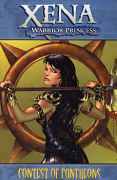 Written by John Layman. Art by Fabiano Neves.
Colours: Richard Isanove. Letters: Simon Bowland.
Reprinting: Xena (Dynamite series) #1-4
Rating: * * * 1/2 (out of 5)
Number of readings: 1
Published by Dynamite Comics
The TV series Xena: Warrior Princess is another one of those properties that has gone through a few comic book incarnations, first from Topps, then Dark Horse (both while the series was on the air, I believe), and more recently Dynamite, a company that has so far made its mark resurrecting older properties.
Like with a lot of media tie in properties, I'm not sure how well the Xena franchise has fared in comics. Neither the Topps nor the Dark Horse runs were particularly long, and even Dynamite has so far only produced two story arcs and an annual (and a few Xena/Army of Darkness crossovers).
Anyway, Xena spun off from the TV series, Hercules: The Legendary Journeys, and was set in the same Ancient Greece, involving machinations of Gods and warlords, but with tongue firmly in cheek, as characters talked in decidedly un-archaic colloquialisms, and the tone could shift from wacky slapstick to angst riddled and grim. And the series ended with Xena dead, but her ghost continuing to travel with her sidekick, Gabrielle.
Instead of dealing with that, Dynamite has perhaps wisely begun its run simply with a four part story in which Xena is fit and fiddle and corporeal, travelling with Gabrielle, in a way that very much resembles the series (the next Dynamite story arc, collected as Dark Xena, apparently was set between the TV series and this story, and explained how she got from being dead to alive). In other words, you can just read it for itself, as a Xena adventure, and not worry about the overall continuity. The plot here has the Greek and the Egyptian gods at war with each other over a stolen necklace, but then decide their dispute would be better settled by choosing human champions to fight it out.
The first chapter is a bit uneven in the telling, which can probably be laid at the feet of both the writer and the artist. There are a few scenes that seem not to flow too logically from each other -- Xena and Gabby escape a sinking ship in a life raft...then land on shore apparently with crates of supplies; they flee a pillaged village and run into some thugs tormenting Autolycus -- but wouldn't the thugs be running away from the conflict too? (Now maybe the point was that there was a greater time/distance gap between Xena and Gabby running from the conflict and their encountering Autolycus, but that's not obvious).
Oh, and the story is heavy on the familiar guest stars, with recurring characters like Joxter, Autolycus, and Calisto all along for the ride. On one hand it can make the story seem a bit too much like a fanboy reunion...on the other hand, maybe that's what it is, since it is, after all, the first new Xena story in years.
Anyway, as we build to the climax of the first chapter, there were three ways it could go: the obvious (which you figure a mediocre writer will do), the cleverly less-obvious (which you think the writer should do), and the unexpected (which you can't anticipate because that's why it's unexpected). I was assuming Layman would go for the obvious...and so was pleasantly surprised when he went for the less obvious, raising both him and the story a bit in my estimation. And sure enough, the rest of the saga proves a decent romp. At 88 pages, it's not exactly a masterpiece of Byzantine plotting and character nuances (heck, that "less obvious" twist doesn't actually have much impact on the story's direction), but Layman does throw in enough twists and turns (with a hidden agenda or two) that the story emerges as more than simply an excuse for a contest of combatants. In fact, part way through, the contest itself gives way to another plot.
The problem a property like Xena has when translated into comics (or novels) is to capture the series' eclectic mix of comedy and drama, self-reflective and sincere. It's hard to do slapstick in a printed form, and its hard to blend the styles without an actor acting as the bridge. But Layman tries gamely, and gets better as the story progresses, mixing in the witty quips that suit the various characters, or a confrontation with some Storm Giants that goes for the humour rather than the action. Though the fight scenes are basically generic fight scenes, rather than trying to mimic the series' carefully choreographed, John Woo-esque fights.
Fabiano Neves art is a bit stiff, but certainly evokes the characters easily enough (though only his Joxter really looks photo-referenced) and his women -- Xena, Gabby, etc. are quite beautiful. The art, combined with Richard Isanove's beautiful, lush colours, has a rich, almost painted look at times, suitable for this fantasy setting (and reminiscent of the verdant New Zealand countryside in which the series was filmed...or the old CrossGen Comics publishing line). Though like a lot of modern comics, the visuals can be a tad gorier at times than is necessary, and than the series itself was.
Ultimately, despite some initial flaws, Contest of Pantheons is a solid enough effort, the characters are in character and it's perfectly evocative of the series it is derived from, without seeming too much like just a rehash of old cliches (despite the reliance on familiar supporting characters). It doesn't jump any bars, but it is a better-than-decent chance to revisit the series.
This is a review based on the story as it originally
appeared in the comics.
Cover price: ___
Media Tie-Ins < BACK on to NEXT >
Back to complete list of all GNs/TPB reviews or