Sometimes Robert's Fan Gets Pretty Dirty
And He Isn't Always Able To Smile

|
- This is only an attempt to demonstrate some of the technical aspects
of using Gif Construction Set. I will leave the artistic subtleties
to my betters hehe :-)
- My attempt here is to keep the file size to a minimum for quick
loading of the gif for the user.
- The pixel size of the completed smiley will be 75x75x256 colors
which is a fair sized icon I think.
- I am going to use only one full size background frame, and the rest
of the frames will be a minimum size for the animation.
- Here are all the components that go into making up the Animation.
|


|
- You will note there are two sets of eyes open/closed to toggle between
left and right eye. 7 Components in all.
- To download a zipped file of all the components of this project
Click Here.
|
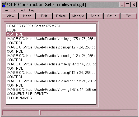
- When you first open "smiley-rob.gif" in Gif Construction,
you will be presented with the following window

- The image and control lines are what you can use to manage your
animation. There is tons of room here to have lots of fun, and do
some wild and interesting things with your animations.
|
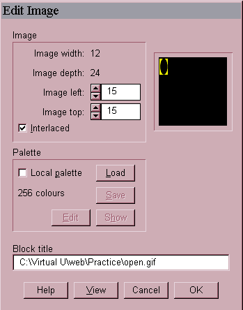
- By double clicking on one of the image definition lines, you will
be get this Edit Image window

- Here is where I set the first eye for example to be displayed at
an offset of left = 15, top = 15.
- This means that starting at the top left corner (0,0) the first
eye will be placed/viewed 15 pixels down from the top, and 15 pixels
to the right.This may take some playing around.
- To get an approximate position for offset placing your frames in
PSP, move your cursor around in the PSP image, and watch the bottom
of the PSP Window. You will see two numbers enclosed in brackets (0,0),
the first is for the horizontal position, and the second is for the
vertical position. These numbers will give you a good guess at where
you want to place your frames.
- Later you can touch them up here in the Gif Construction Edit Image
Options.
- At any time you can use the View option to have a look at how you
are progressing, or to get a visual view of the placement of your
frame.
|
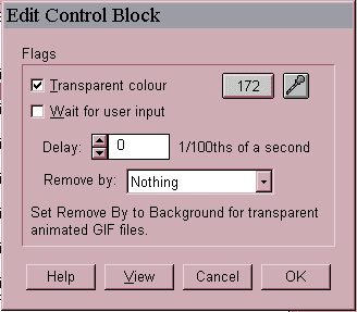
- By double clicking on one of the control definition lines, you will
be get this Edit Control window

- Here is where I have a lot of control over how the image is displayed
such as timing, background transparency, what method is used to remove
the frame etc.
- These are pretty powerful options as well, and can be a lot of fun
to play with, and learn to use.
- In this example I have use a transparency value of 172, which is
the gray background of the yellow circle frame for the main part of
the animation.
- The easiest way to assign the transparency color, is to open the
image statement for the first frame, and then click on the eyedropper.
- This will present you with an image, and you will then click on
the color you want to be transparent.
|
This is only the tip of the iceberg
Have Fun With It
The object of any exercise is to have fun and relax while learning.
XOXOXOXO Rob
|


